
The Peculiar Math Behind Mixture Experiments: A Sugar-Sweetness Case Study
Ever run a mixture experiment where every component looks like a win, only to have the trace plot tell a different story? The following FAQ tackles that exact puzzle — why some ingredients can show a “negative” track in a trace plot even when they contribute positively overall. Stat-Ease consultant Mark Anderson breaks down the mixture-model math behind it using a simple sugar-sweetness example.
Original question from a chemist:
“I completed a mixture screening experiment to assess the effects of 3 components. All ingredients produced positive effects. However, the trace plot contradicts this outcome—several of the components (A, B and C) displaying negative tracks. How can this be?”
Answer from Stat-Ease:
“This is a peculiarity of the mixture models (also known as Scheffé polynomials). I created a similar example on a hypothetical mixture of 3 types of sugar by setting up an equation-only model: R = 1A + 2B + 3C. Then I generated a trace plot showing how the predicted response changes when you increase one component while keeping the ratios of the other components constant.
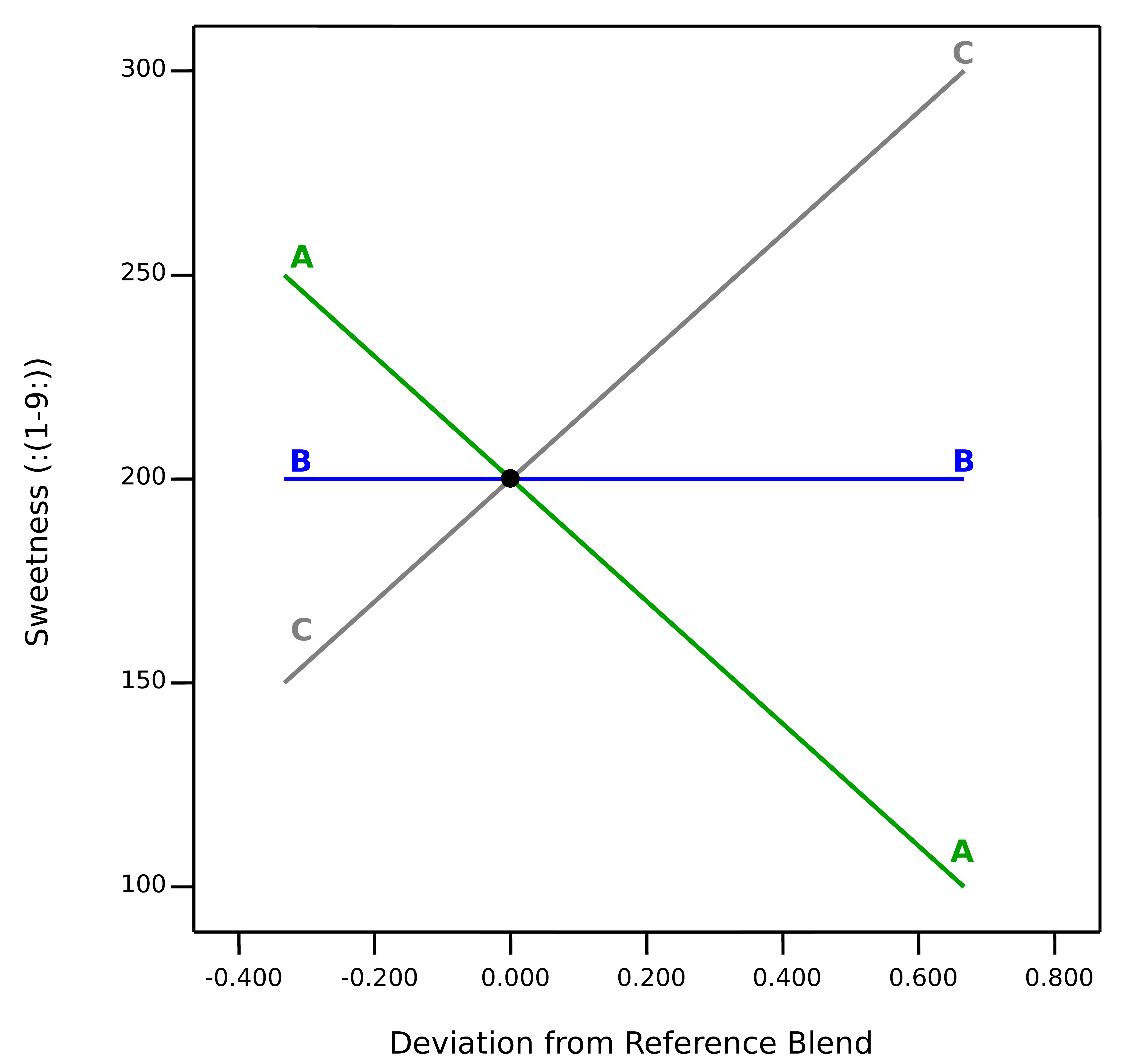
Trace plot from mixture screening experiment
The plot shows the downward impact of A (sugar S1) on sweetness due to it having the lowest coefficient of the three ingredients. This is relative to the other ingredients, adding more of that specific component does not lower the response on its own. Component B (sugar S2) generates a flat track—it’s impact on sweetness is ‘middling.’ The most impactful ingredient is C (sugar S3), as evidenced by its upward track.
For another example showing the trace plot being put to good use, see the November 2024 blog Perfecting pound cake via mixture design for optimal formulation.