Multilevel Categoric (pt 2)
Note
Screenshots may differ slightly depending on software version.
Part 2 - Making Factors Numeric
Continued – A Case Study on Battery Life
In the preceding, Multilevel Categoric Tutorial – Part 1, you treated all factors categorically. The main purpose of Part 2 of this tutorial is to illustrate some of the functions built into Stat-Ease software that can be used to make effects graphs better fit the type of data we’re dealing with, as well as making the results easier to interpret and understand. We’ve already said that Montgomery’s classic battery experiment could have been handled by using the Response Surface tab and constructing a one-factor design on temperature, with the addition of one categorical factor at three levels for the material type. Never fear, we’ll cover response surface methods like this from the ground up in the Response Surface Tutorials. But to demonstrate the flexibility of Stat-Ease software, let’s explore how you can make the shift from categoric to numeric after-the-fact, even within the context of a general factorial design.
If your battery data remains active from Part 1 of this tutorial, continue on. Otherwise, load the data via Help on the main menu, selecting Tutorial Data and then Battery Life. Then, if not already there, click the Design node.
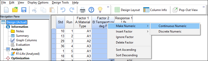
Changing a Factor from Categoric to Numeric
Right-click on the B:Temperature factor column heading, and select Make Numeric then Continuous Numeric. (The “discrete” option could also work in this case. It works well for numeric factors that for convenience-sake must be set at specific levels. For example, imagine that the testing chamber for the batteries has only three settings – 15, 70 and 125.)
Options for editing a factor
The software pops up a warning not to do this if the factor really is categorical. To acknowledge it and move on, click the OK button below the message.

Warning message
Re-Analyzing the Results
To re-analyze your data, click the analysis node labeled Life. Then click Start Analysis and then the Model tab. When you designated a factor being numeric, the program automatically shifted to fitting a polynomial, such as those used for response surface methods. To model non-linear response to temperature (factor B), double-click the AB2 term, or via a right click add it to the Model as shown below. (Squared terms capture curvature.)

Model selection screen
Click the ANOVA tab. You will get a warning about hierarchy.

Hierarchy warning
This warning arises because you chose a higher order term without support by parent terms, in this case: AB and B2. Click Yes and move on.
Note
Statistical reasons for maintaining model hierarchy: For details, search out the topic on “Model Hierarchy Check” in the Help System.
The ANOVA report now displays in the view (annotated or not) that you used last. By comparing this output with the ANOVA done in Part One, observe that the lines for the model and residual come out the same, but the terms involving B differ. In Part One we treated factor B (temperature) categorically, although in an ordinal manner. Now that this factor is recognized explicitly as numeric, the effect of B is now broken down to two model terms – B and B2, and AB becomes AB plus AB2.

ANOVA output
The whole purpose of this exercise is to make a better looking effects graph. Let’s see what this looks like by clicking the Model Graphs tab. Go to the Factors Tool on the right, right-click the box next to B:Temperature and change it to the X1 Axis.

Viewing the interaction with temperature on X-axis
The lines are now curvy and continuous with temperature, whereas in Part One they were displayed as discrete (categorical) segments. Notice that the curves by temperature (modeled by B) depend on the type of material (A). This provides graphical verification of the significance of the AB2 term in the model.
The dotted lines border the colored 95% confidence interval (CI) bands. To provide a cleaner view, right-click the graph and select Graph Preferences. Now move to the XY Graphs section and find Polynomial: LSD bars or bands, then select the None option as shown below.

Turning off confidence bands
Press OK. That cleans up the picture leaving the points on for perspective. (If you prefer to just show the lines, right-click over the graph and select Graph Preferences. Then, under the All Graphs section, turn off (uncheck) the Show design points option.)
Your plot should now look like that copied out below. (Note: if you don’t have the A1, A2, and A3 labels, remove the legend from your graph by going to View->Show legend).

Presentation of battery life made of various materials versus temperature on continuous scale
The conclusions remain the same as before: Material A3 will maximize battery life with minimum variation in ambient temperature. However, by treating temperature numerically, predictions can be made at values between those tested. Of course, these findings are subject to confirmation tests.
Postscript: Demo of “Pop out” View
Before exiting, give this a try: Go to View and select Pop-Out View.

Pop-Out View
This pushes the current graph out of its fixed Windows pane into a ‘clone’ that floats around on your screen. (If you do not see the popped-out pane, press Alt-Tab.) Now on the original Factors Tool right click the box next to A:Material and return it to the X1 Axis. Then do an Alt-Tab to bring back the clone of the previous view back on your current window.

Two ways of viewing the battery life results
You can present Stat-Ease outputs both ways for your audience:
Curves for each material as a function of temperature on the X1 axis, or
Two temperature lines connected to the three discrete materials as X1.
Another (far less messy!) way to capture alternative graphs is to copy (via right-click) and paste them into Powerpoint or the like. Then you can add annotations and explanations for reporting purposes.
