One-Factor RSM
Note
Screenshots may differ slightly depending on software version.
(Part 1 – The basics)
Introduction
In this tutorial you will get an introduction to response surface methods (RSM) at its most elementary level – only one factor. If you are in a hurry, skip the “Note” sections. These are intended only for those who want to spend more time and explore things.
The data for this one-factor tutorial, shown below, comes from RSM Simplified, 2nd Edition (Mark J. Anderson and Patrick J. Whitcomb, 2017, Productivity, Inc., New York: Chapter 1).
x: Departure (minutes) |
y: Drive time (minutes) |
|---|---|
0 |
30 |
2 |
38 |
7 |
40.4 |
13 |
38 |
20 |
40.4 |
20 |
37.2 |
33 |
36 |
40 |
37.2 |
40 |
38.8 |
47.3 |
53.2 |
Commuting times as a function of when the driver leaves home
The independent (x) variable (factor) is the departure time for Mark’s morning commute to work at Stat-Ease, Inc. Time zero (x=0) represents a 6:30 A.M. start, so for example, at time 40, the actual departure is 7:10 A.M. Mark wants to quantify the relationship between time of departure and the length in minutes of his commute – the response “y”.
Let’s begin by setting up this one-factor RSM experiment in Stat-Ease software. Be forewarned, we must do some editing of the design to deal with some unplanned events in the actual execution. Fortunately, the software allows for such revising in the experimental design layout and deals with any repercussions in the subsequent analysis.
Design the Experiment
Start the program and click New Design.
You now see a number of design options at the left of your screen. Click Response Surface to expand it. Then select Optimal (Custom) design and change Numeric factors to 1.
Note
Explore other response surface design options: Note that the first two designs on this tab — the Central Composite and Box-Behnken – do not support experiments on only one factor. Work through the Multifactor RSM Tutorial to explore program tools from multiple-factor response surface methods.
Your screen should now look like the one shown below.

One factor response surface design
Now enter, for factor A, the Name, Units, L[1], and L[2] inputs as shown below.

Entering factor name, units, and low/high experimental range levels
Press Next to continue to the optimal algorithm configuration screen.
Mark’s initial theory was that traffic comes in waves. In other words, traffic does not simply increase in a linear fashion as rush hour progresses. Instead, he hypothesized that traffic builds up, backs off a bit, and then peaks in terms of density of cars on the roads into town. Standard RSM designs, such as central composite (CCD) and Box-Behnken, are geared to fit quadratic models (refer to RSM Simplified for math details). Generally this degree of polynomial proves more than adequate for approximating the true response. But in this case, where the response may be ‘wavy,’ we will notch up to the third-order Model labeled Cubic.
Click on the Edit model… button and change the dropdown to Cubic, then press OK.

Selecting a cubic model
Notice that the number of runs increases from 13 to 14 after upgrading your model from its default of quadratic. Press Next to move on to the response entries. Now enter “Drive time” for the Name and “minutes” for the Units.
Press Finish to see the resulting design displayed in randomized run order.
Modify the Design as Actually Performed
Normally you’d now print your screen and use it as a procedure (recipe) sheet. However, since Mark already completed the experiment, we’ll load the data he gathered by using the Help, Tutorial Data menu and selecting Drive Time from the list.
You’ll notice that there are only 10 runs in the design now. This is because Mark removed 3 of the center points and one of the lack of fit points due to time constraints. You may also notice that there is a Departure value beyond the high of 40. This was a day that Mark woke up late, and had to modify the factor value to reflect the reality of how the experiment was run.
Note
Explore LOESS fit: Click the Custom Graphs node to see a scatter plot of drive times. Then click on the checkbox in the LOESS tool to see a locally weighted smoothing. You can play around with the bandwidth to see how it affects the fit. However, keep in mind that this is more for visualization purposes—it is completely speculative at this stage.
Analyze the Results
Before we start the analysis, be forewarned that you will now get exposed to quite a number of statistics related to least-squares regression and analysis of variance (ANOVA). If you are coming into this cold, pick up a copy of RSM Simplified and keep it handy. For a guided tour of design and analysis of response surface methods, attend the Stat-Ease “Modern DOE for Process Optimization” workshop. Details on this computer-intensive class can be found at www.statease.com.
Under the Analysis branch click the node labeled Drive time to see a screen for configuring the analysis. In this case a transformation is not warranted, so leave it at the default and press Start Analysis.
The program provides the Fit Summary to start. Note that it already assessed and suggested the Cubic model. For the reasons why, let’s look at the underlying tables – starting with the Sequential Model Sum of Squares tab. This table evaluates each degree of the model from the mean on up.
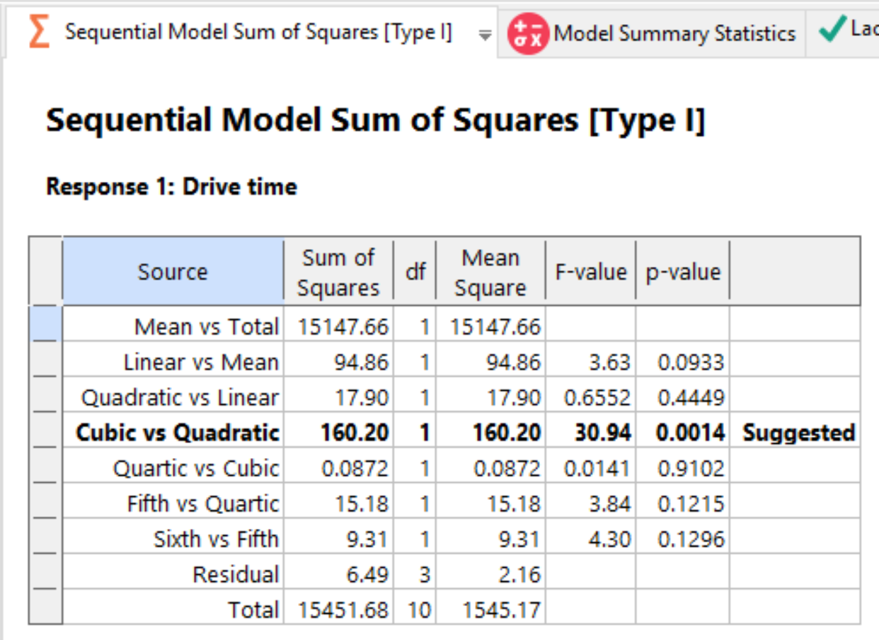
Fit Summary - table of sequential model sum of squares
See RSM Simplified Chapter 4 if you are interested in the details. The program suggests the cubic model and underlines that line in this table of sequential sum of squares. The extremely low p-value for the suggested cubic terms indicates a highly significant advantage when adding this level to what’s already been built (mean, linear, and quadratic).
Next click on the Lack of Fit Tests tab.

Lack of fit tests
The cubic model produces insignificant lack of fit – that’s good!
Finally, click on the Model Summary Statistics tab.

Model summary statistics
It should be no wonder that the program suggests a cubic model. Look how much lower the standard deviation is from this model and how much better it is compared with lower-order models for R-squared – raw, adjusted, and predicted. Also the cubic model produces the least PRESS (predicted residual sum of squares) – a good measure of its relative precision for forecasting future outcomes.
Move on by clicking on the Model tab above. It’s pre-set the way the software suggested (Cubic), so without further ado, press ANOVA for the analysis of variance. The program reports that the outcome for the model is statistically significant. It also tells you that the lack-of-fit is not significant.

ANOVA
In the Coefficients tab you can see details on the model coefficients, including confidence intervals (CI) and the variance inflation factors (VIF) – a measure of factor collinearity. A simple rule-of-thumb is that VIFs less than 10 can be disregarded, so perhaps Mark did not botch things too badly by missing some of his scheduled times for departure.
Click on Actual Equation. This formula will be most useful for Mark, because he can simply plug in his departure time in minutes (zero represents 6:30 AM) and get an estimate of how long it will take to drive to work. However, it pays to do some checking before making use of predictive models generated via RSM.

Actual equation for predicting drive time
Note
Right click any part of the equation to pull up an option to Copy Formula. If you have Microsoft Excel, you can then paste the formula there and use Excel to make predictions for a given departure time.
Analyze Residuals
Press the Diagnostics button to see plots of of the residuals.
Notice they are colored by drive time. Click the red one – this is the longest commute resulting from Mark oversleeping one day when the design said he ought to have left at the earliest time. This will select the point in all the other residual plots.

Diagnostic plots
The Normal Plot plot looks good. All the points line up nicely and the test for departure from normality is insignificant.
For Residual vs Run, notice that the highlighted residual — the one stemming from the highest response — falls well within the red lines, that is, it varies only due to common-cause variations. Thus there is no reason to remove this result, albeit unplanned experimentally, from the analysis.
The Pred. vs Actual plot shows how precisely the drive time is modeled. The points show some scatter around the 45 degree line in the times below 40, but it hits the high point directly. That’s good!
Note
To assess the impact of Mark’s late departure in run 5, look at the Leverage plot. The run is above the red threshold for this statistic, which is twice the average leverage of all the runs in the experiment (0.4). This does not mean the run is a statistical outlier — it fell within the limits on the Residual vs Run plot. However, this particular set of experimental data relies heavily on this one high leverage point for fitting one or more of the model terms. That’s good to know.
View the Effects Plot
OK, we are finally at the stage where we can generate the response surface plot and see how drive time varies as a function of the time of departure: Press Model Graphs to produce the response surface plot. The dotted lines border the shaded 95% confidence band on the mean prediction at any given departure time.

One factor model graph (response surface plot)
Oops! The program still thinks Mark will never leave more than 40 minutes later than the earliest time. But as you know, he goofed up one morning and left over 47 minutes later. To remedy this, use the Jump to run dropdown in the Factors Tool to select run 5. The program will expand the X range to include that point automatically.

One factor model graph with expanded X-axis
Ah ha! It appears that Mark might be seeing a ‘hole’ in the traffic, that is, a trough in the drive time that opens up 25 minutes or more after the earliest departure time. Therefore, he might get a bit more sleep without paying too harsh of a penalty in the form of a longer commute. However, he’d better be careful, further delays from this point could cause him to be very tardy for work at Stat-Ease.
Note
Stat-Ease software provides tools for direct export to Word or PowerPoint. If you have these Microsoft Office applications installed, now is a good time to try these export options. They can be found by right-clicking a graph, in the Export submenu. The same menu is available via the down-arrow on any graph tab. In addition, you can export to many different file formats, including portable network graphic (“png”) and encapsulated postscript (“eps”).
That’s it for now. Save the results by going to File, Save. You can now exit the program if you like, or keep it open and go on to the next tutorial – part two of this one-factor RSM, which delves into advanced features via further adventures in driving.