Note
Screenshots may differ slightly depending on software version.
Two-Level Factorial
Introduction
This tutorial demonstrates the use of Stat-Ease® software for two-level factorial designs. These designs will help you screen many factors to discover the vital few, and perhaps how they interact. If you are in a hurry, skip the “Note” sections—these are sidebars for those who want to spend more time and explore things.
Note
Fundamental features of the program: Before going any further with this tutorial, go back and do the ones on One-Factor experiments. Features demonstrated there will not be detailed here.
We will presume that you are knowledgeable about the statistical aspects of factorial design. For a good primer on the subject, see DOE Simplified, Practical Tools for Effective Experimentation, 3rd edition (Anderson and Whitcomb, Productivity, Inc., New York, 2015). You will find overviews on factorial design and how it is done via the Help system. To gain a working knowledge of these core tools for DOE, we recommend you attend our Modern DOE for Process Optimization workshop. Visit www.statease.com and follow the Learn DOE link for more details on this and other educational resources from Stat-Ease.
The data you will now analyze comes from Douglas Montgomery’s textbook, Design and Analysis of Experiments, published by John Wiley and Sons, New York. A waferboard manufacturer must immediately reduce the concentration of formaldehyde used as a processing aid for an adhesive-filtration operation, or they will be shut down by regulatory officials. To systematically explore their options, process engineers set up a full-factorial two-level design on the key factors, including concentration at its current level and an acceptably low one.

Factors and levels for full-factorial design example
At each combination of these process settings, the experimenters recorded the filtration rate. The goal is to maximize the filtration rate and also try to find conditions that allow a reduction in the concentration of formaldehyde, Factor C. This case study exercises many of the two-level design features offered by Stat-Ease software. It should get you well down the road to being a power user. Let’s get going!
Note
What to do if a factor like temperature is hard to change: Ideally the run order of your experiment will be completely randomized, which is what the program will lay out for you by default. If you really cannot accomplish this due to one or more factors being too hard to change that quickly, choose the Split-Plot design. However, keep in mind that you will pay a price in reduced statistical power for the factors that become restricted in randomization. Before embarking on a split-plot design, do the Split-Plot Two-Level tutorial to get an orientation on how Stat-Ease software designs such an experiment and what to watch out for in the selection of effects, etc.
Design the Experiment
Start the program and click New Design.
You now see a number of major branches to the left of your screen. Stay with the Factorial choice, which comes up by default. You’ll be using the default selection: Randomized > Regular Two-Level.

Two-level factorial design builder
Note
Stat-Ease software’s design builder offers
full and fractional two-level factorials for 2 to 21 factors in powers of two
(4, 8, 16…) for up to 512 runs. The choices appear in color on your screen.
White squares symbolize full factorials requiring 2k runs for k (the
number of factors) from 2 to 9. The other choices are colored like a stoplight:
green for go, yellow for proceed with caution, and red for stop, which represent
varying degrees of resolution: ≥ V, IV, and III, respectively. For a quick
overview of these color codes, press the screen tips button ![]() to the right
of the Topic Help icon (
to the right
of the Topic Help icon (![]() ) (if not on screen, press >> to get it
in view).
) (if not on screen, press >> to get it
in view).
Let’s get on with the case at hand – a full-factorial design. Click the white square labeled 24 in column 4 (number of factors) in the Runs row labeled 16.

Selecting a full, two-level design on four factors which produces 16 runs
Click the Next button. You can also just double-click on a design to select it and continue. You can now enter the names, units of measure, and levels for your experimental factors. Use the arrow keys, tab key, or mouse to move from one space to the next. Enter for each factor (A, B, C and D) the Name, Units, Low and High levels shown on the screen shot below.

Factors - after entering name, units, and levels
Note
How to enter alphanumeric levels: Factors can be of two distinct types – “Numeric” or “Categoric.” Numeric data characterizes a continuous scale such as temperature or pressure. Categoric data, such as catalyst type or automobile model, occurs in distinct levels. Stat-Ease software permits characters (for example, words like “Low” or “High”) for the levels of categorical factors. You change the type of factor by clicking on cells in the Type column and choosing “Categoric” from the drop down list, or by typing “C” (or “N” for numeric). Give this a try – back and forth! Leave the default as “Numeric” for all factors in this case.
Now click Next to bring up the Responses dialog box. With the list arrow you can enter up to 999 responses (more than that can be added later if you like). In this case we only need to enter a single response name (Filtration Rate) and units (gallons/hour) as shown below.

Response values entered
It is good to now assess the power of your experiment design. In this case, management does not care if averages differ by less than 10 gallons per hour (there’s no value in improvements smaller than this). Engineering records provide the standard deviation of 5 (the process variability). Enter these values as shown below. The program then computes the signal to noise ratio (10/5=2).

Power wizard - necessary inputs entered
Press Next to view the positive outcome – power that exceeds 80 percent probability of seeing the desired difference.

Results of power calculation
Click Finish to accept these inputs and generate the design layout window.
You’ve now completed the first phase of DOE – the design. Notice that this is one of four main features (branches) offered by Stat-Ease software, the others being Analysis, Optimization and Post Analysis (prediction, confirmation, etc.).
Note
Click the Notes node to take a look at what’s written there by default. Add your own comments if you like.

Notes on data file
Exit the notes page by clicking the Design node. (Notice the node appears as Design (Actual) – meaning your factors are displayed in actual levels, as opposed to coded form).
You’ve put in some work at this point so it is a good time to save it. The
quickest way of doing this is to press the standard save icon ![]() .
.
Enter the Response Data
At this stage you normally would print the run sheet, perform the experiments, and record the responses. The software automatically lists the runs in randomized order, protecting against any lurking factors such as time, temperature, humidity, or the like. For this tutorial we will just load the data by clicking Help, Tutorial Data -> Filtration Rate.

Opening the data file
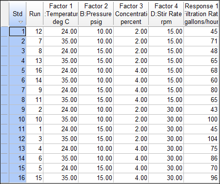
Double-click the Std column header (on the gray square labeled Std) to sort as shown below.

Sorting by standard (Std) order
Your data should now match the screen shot shown below. (When doing your own experiments, always do them in random order. Otherwise, lurking factors that change with time will bias your results.)
Design layout in standard order - response data entered
Note
How to adjust column widths: To automatically re-size truncated columns, move the cursor to the right border of the column header until it turns into a double-headed arrow. Double-click and the column will be resized to fit the Column Header.
Don’t bother now after just opening the file of data, but if you enter responses,
it’s another opportune time to save the updated file by clicking the Save icon
![]() .
.
Note
How to change number formats: The response data came in under a general format. In some cases you will get cleaner outputs if you change this to a fixed format. Click the Response column heading (top of the response column), and look at the Design Properties pane on the left of your screen. Click the Format box and you’ll see the down arrow appear next to General. Click the down arrow and select 0.0

Changing the format
Using the Design Properties pane, you can also change input factors’ format, names, or levels. Try this by clicking any other column headings.
The program provides two methods of displaying the levels of the factors in a design:
Actual levels of the factors.
Coded as -1 for low levels and +1 for high levels.
The default design layout is actual factor levels in run order.
Note
To view the design in coded values, click Display Options on the menu bar and select Process Factors - Coded. Your screen should now look like the one shown below.

Design layout - coded factor levels (your run order may differ)
Notice that the Design node now displays “coded” in parentheses – Design (Coded). This can be helpful to see at a glance whether anyone changed any factor levels from their design points.
Now convert the factors back to their original values by clicking on Display Options from the menu bar and selecting Process Factors - Actual.
Pre-Analysis of Effects via Data Sorts and Simple Scatter Plots
Stat-Ease software provides various ways for you to get an overall sense of your data before moving on to an in-depth analysis. For example, you can quickly sort columns by double-clicking on them.
To see this, move your mouse to the top of column Factor 1 (A: Temperature) and double-click to sort ascending. Double-click again and it will be descending. Do it once more (the arrow should be pointing down) to see how going from low to high temperature affects Filtration.

Sorting the design on a factor
You will now see more clearly the impact of temperature on the response. Better yet, you can make a plot of the response versus factor A by selecting the Custom Graphs node (formerly called “Graph Columns”) ) that branches from the design ‘root’ at the upper left of your screen. You should now see a scatter plot with (by default) factor A:Temperature on the X-axis and the response of Filtration Rate on the Y-axis.
Observe by looking at the graph how temperature makes a big impact on the response. This leads to the high correlation reported on the legend.

Legend for default graph columns on filtration data
Another indicator of the strong connection of temperature to filtration rate is the red color in the correlation grid at the intersection of these two variables. Note that you can also see the correlation number just above the grid next to a colored scale indicating correlation.

Correlation grid - switching graph from factor A (left) to B (right)
To see the impact of the next factor, B, click the next square to right as shown above. Notice now that pressure has little correlation with filtration rate—this relationship turns out to be insignificant (correlation is low at 0.08)
Note
How to use the Color By feature: Go back to the scatter plot of A versus Filtration Rate. By default the points are colored by standard order. Click the Color By drop-down list and select C: Concentration as shown below.

Graph columns for temperature versus filtration rate, colored by concentration
Do you see how two colors stratify at each level of temperature – but oppositely – red at the top for the rates plotted at the left (temperature 24) versus blue coming out higher for filtration rate at the right? Consider what this may indicate about how concentration interacts with temperature to produce an effect on filtration rate. However, let’s not get ahead of ourselves – this is only a preliminary to more thorough analyses using much more sophisticated graphical and statistical tools.
You may wonder why the number “2” appears besides a few points on this plot. This notation indicates the presence of multiple points at the same location. Click on one of these points more than once to identify the individual runs (look at the legend to the left of the graph).
Now for a really awesome scatterplot change the Y1 Axis to Factor > D:Stir Rate and the Z Axis to Response > Filtration Rate. This shifts graph columns to the third dimension, which provides a dramatic view of conditions leading to maximizing the response at the top left. The blue points at the top are at low concentration of formaldehyde. This looks extremely promising!

3D scatterplot enabled by plotting the response on the Z Axis as a function of two factors
Coming up soon, you will use powerful analysis features in Stat-Ease software to find out what’s really going on in this wafer-board production process.
Analyze the Results
To begin analyzing the design, click the Filtration Rate response node on the left side of your screen. Leave the Configure analysis options at their default of linear regression with no transform, and press Start Analysis. This brings up the analytical tool bar across the top of the screen. To do the statistical analysis, simply click the tabs progressively from left to right.
Choosing Effects to Model
Under the Effects tab, the program displays the absolute value of all effects (plotted as squares) on a half-normal probability plot. On the right is the Pareto plot (more on that later). Color-coding provides details whether the effects are positive or negative.

Half-normal plot of effects - nothing selected
Note the message on your screen: “Select significant terms – see Tips.” You must choose which effects to include in the model. If you proceed without doing so at this point, you will get a warning message stating “You have not selected any factors for the model.” The program will allow you to proceed, but with only the mean as the model (no effects), or you can opt to be sent back to the Effects view (a much better choice!).
You can select effects by simply clicking on the square points. Start with the largest effect at the right side of the plot, as shown below. Notice that it also becomes selected on the Pareto plot.

First effect chosen
By default the red “error line” will be placed such that it represents the smallest 50% of the effects. It is intended to be a visual guide to assist with selecting effects. The unimportant effects should line up on a line near zero. If the line doesn’t match the small effects, you can click and drag it to line up with group of smallest (on the left) effects.
Keep selecting individual effects from right to left until you’ve selected all the effects that are off the line. In this case, the last effect to select is factor C. There is a big gap between C and the smaller effects that line up near zero. This gap is often a good indication to stop selecting effects.
Note
Press the handy screen ![]() button to learn more about using the
half-normal plot to select effects.
button to learn more about using the
half-normal plot to select effects.

Half-normal probability plot - all big effects selected
You can also select multiple effects at once by dragging a box around them.
To really see the magnitude of the chosen effects, the program displays them on an ordered bar chart called the Pareto plot. Notice the vertical axis shows the t-value of the absolute effects. This dimensionless statistic scales the effects in terms of standard deviations. In this case, it makes no difference to the appearance of the chart, but when you encounter botched factor levels, missing data, and the like, the t-value scale provides a more accurate measure of relative effects. Click the next biggest bar and notice it is identified as ABD as shown below (lower right).

Pareto chart of effects with ABD picked (a mistake!)
Notice that the ABD bar falls below the bottom limit, so click the bar again to deselect it.
Note
To see quantitative detail on the chosen model effects and those
remaining for estimation of error, click Numeric. Click the full window
icon  at the top for a better view. This screen enables another
method of model selection via the “Autoselect…” button. For now, we’ll stick
with the model chosen on the half-normal plot. Autoselect is more useful for
response surface designs and will be detailed in those tutorials.
at the top for a better view. This screen enables another
method of model selection via the “Autoselect…” button. For now, we’ll stick
with the model chosen on the half-normal plot. Autoselect is more useful for
response surface designs and will be detailed in those tutorials.

Effects list
ANOVA and Statistical Analysis
It is now time to look at the statistics in detail with the analysis of variance (ANOVA) table. Click the ANOVA tab to see the selected effects and their coefficients. By default, the program provides annotations in blue text.
Note
Annotations can be toggled off via the View menu.
Check the probability (“p-value”) for the Model. By default, the program considers values of ≤ 0.05 to be significant. This can be changed via Edit > Preferences > Math Preferences > Math Analysis.
Inspect the p-values for the model terms A, C, D, AC, and AD: All pass the 0.05 test with room to spare.

ANOVA report
Note
Context-sensitive Help: Definitions for numbers on the ANOVA table can be obtained by right clicking and choosing Help. Try this for the Mean Square Residual statistic, as shown below.

Accessing context-sensitive Help
Observe the other panes of the ANOVA output for further statistics such as R-squared and the like. Refer to the annotations and also access Help for details. Take a look at the Coefficients tab to see estimates for the model coefficients and their associated statistics. Lastly, click the Coded Equation and Actual Equation tabs for the predictive equations both in coded and uncoded form.
Rather than belabor the numbers, let’s move on and ultimately let the effect graphs tell the story. However, first we must do some diagnostics to validate the model.
Validate the Model
Click the Diagnostics tab to generate a normal probability plot of the residuals.

Normal plot of residuals
By default, residuals are studentized – essentially a conversion to standard deviation scale. Also, they are done externally, that is, with each result taken out before calculating its residual. Statisticians refer to this approach as a “case deletion diagnostic.” If something goes wrong in your experiment or measurement and it generates a true outlier for a given run, the discrepant value will be removed before assessing it for influencing the model fit. This improves the detection of any abnormalities.
Note
Raw residuals: For standard two-level factorial designs like this, plotting the raw residuals (in original units of measure) will be just as effective. On the Diagnostics Toolbar, pull down the options as shown and choose Residuals (raw) to satisfy yourself that this is true (the pattern will not change appreciably).

Changing the form of residuals
We advise that you return to externally studentized scale in the end, because as a general rule this is the most robust approach for diagnosing residuals.
Ideally the normal plot of residuals is a straight line, indicating no abnormalities. The data doesn’t have to match up perfectly with the line. A good rule of thumb is called the “fat pencil” test. If you can put a fat pencil over the line and cover up all the data points, the data is sufficiently normal. In this case the plot looks OK, so move on.
Select the Resid. vs. Pred. (residuals versus predicted) tab, shown below.

Residuals versus predicted response values
The size of the residual should be independent of its predicted value. In other words, the vertical spread of the studentized residuals should be approximately the same across all levels of the predicted values. In this case, the plot looks OK.
Next select and maximize Resid. vs. Run to see a very useful plot that’s often referred to as “Outlier t” because it shows how many standard deviations (t-values) a given run falls off relative to what one would expect from all the others.

Residuals versus run plot
The program provides upper and lower red lines that are similar to 95% confidence control limits on a run chart. In this case none of the points stands out. Furthermore, no abnormal patterns emerge, for example, steadily rising or falling residuals, or many in a row above and/or below the middle line. That is good! An obvious example would be a steady decrease in residuals from start to finish, in other words, a downward trend. That would be cause for concern about the stability of your system and merit investigation. However, by running the experiment in random order, you build in protection against trends in response biasing the results.
Note
What to do if a point falls out of the limits: If there were an outlier, you could click on it to get the coordinates displayed to the left of the graph. The program remembers the point. It will remain highlighted on other plots. This is especially helpful in the residual analysis because you can track any suspect point. This feature also works in the interpretation graphs. Give it a try! Click anywhere else on the graph to turn the point off.
Even more helpful may be the option to highlight a point as shown below.

This flags the run back in your design layout and elsewhere within the program so you can keep track of it. Check it out!
Skip ahead to the Box Cox plot. This was developed to calculate the best power law transformation. (Refer to Montgomery’s Design and Analysis of Experiments textbook for details.) The text on the left side of the screen gives the recommended transformation: in this case, “None.” That’s all you really need to know!
Note
For those of you who want to delve into the details, note that the Box-Cox screen is color coded to help with interpretation. The blue line shows the current transformation. In this case it points to a value of 1 for “Lambda,” which symbolizes the power applied to your response values. A lambda of 1 indicates no transformation. The green line indicates the best lambda value, while the red lines indicate the 95% confidence interval surrounding it. If this 95% confidence interval includes 1, then no transformation is recommended. It boils down to this: If the blue line falls within the red lines, you are in the optimal zone, so no change is necessary in your response transformation.

Box Cox plot for power transformations
P.S. The Box Cox plot will not help if the appropriate transformation is either the logit or the arcsine square root transformation. See the program’s Help system write-up on “Transformations” for further details.
Go back and select the Report tab. Here you see the numerical values for diagnostic statistics reported case-by-case. Discrepant values will be flagged. In this case nothing is detected as being abnormal.

Diagnostics report
Examine Main Effects and Any Interactions
Assuming that the residual analyses do not reveal any problems (no problems are evident in our example), it’s now time to look at the significant factor effects.
On the analytical tool bar at the top of the screen, choose the Model Graphs tab. The AC interaction plot comes up by default. (If your graph displays the x-axis in coded units, return to actual units by choosing Display Options, Process Factors - Actual.)

Interaction graph of factors A (temperature) versus C (concentration)
The “I-Beam” symbols on this plot (and other effect plots) depict the 95% least significant difference (LSD) interval for the plotted points.
Those points that have non-overlapping intervals (i.e. the LSD bars don’t intersect or overlap from left to right through an imaginary horizontal line) are significantly different.
Note
How to do pairwise comparisons: An easy way to verify separation is to do a pairwise comparison. Click on any model prediction (for example the triangle in the middle of the red LSD bars on the left), and you will be shown the pairwise comparisons.

Pairwise comparisons added to the graph. Note that the legend shows which pairs are significantly different.
A horizontal line is drawn through the predicted mean of the highlighted point. Any vertical bars that overlap with this horizontal line indicate predicted means that are not significantly different from the selected point (for example, the red triangle at the right of the graph indicating the prediction for A+, C+). The legend will also tabulate which means are significantly different. Note that even though the displayed pairwise tests are two-sided, only half of the interval is displayed for easier interpretation.
Note also that the spread of the points on the right side of the graph (where Temperature is high) is smaller than the spread between the points at the left side of the graph (where Temperature is low.) In other words, the effect of formaldehyde concentration (C) is less significant at the high level of temperature (A). Therefore, the experimenters can go to high temperature and reduce the concentration of harmful formaldehyde, while maintaining or even increasing filtration rate. This combination is represented by the black square symbol at the upper right of the interaction plot.
The Factors Tool opens along with the default plot, pinned to the right side of the screen. Move the tool as needed by clicking the top blue border and dragging it. Click and drag the tool back to the right side of the screen until you see a blue shadow, then release to lock it back in place. This tool controls which factor(s) are plotted on the graph. At the bottom of the Factors Tool is a pull-down list from which you can also select the factors to plot. Only the terms that are in the model are included in this list.
Note
What happens if you pick a main effect that’s involved in interaction: Click the Term list down-arrow and select A. Notice that the Graphs Tool shifts from Interaction to One Factor.

Changing the main effect of A (a one-factor plot)
More importantly, pay heed to the warning at the top of the plot of A (Temperature). It states “Warning! Factor involved in multiple interactions.” You should never try to interpret main effects plots of factors involved in interactions because they provide misleading information.
Let’s do something more productive at this stage: Go back to the Factors Tool and select from the Term list the other significant interaction, AD.

Interaction AD
Notice on the Factors Tool that factors not already assigned to an axis (X1 or X2) display a vertical slider bar. This allows you to choose specific settings. The bars default to the midpoint levels of these non-axis factors.
Note
Using the factor sliders: You can change levels of fixed factors by dragging the bars, or by typing the desired level in the numeric space near the bottom of the Factors Tool. Check this out by grabbing the slide bar for factor C: Concentration and moving it to the left. Notice how the interaction graph changes.

Interaction AD with the slider bar for factor C set far left at its low (–) level
It now becomes clear that a very high filtration rate can be achieved by going to the high stir rate (the red line for factor D). Click this high point to get all the details on its response and factor values. This is the optimum outcome.
To reset the graph to its default concentration, you could type “3” in the box at the bottom of the Factors Tool (below Stir rate). Factor C must be clicked and highlighted for this to take effect. You can also get the original settings back by pressing the Default button. Give it a try, but remember that going to low concentration of formaldehyde was a primary objective for this process-troubleshooting experiment, so be sure to slide C back to the left again.
You can view the AD interaction with the axes reversed by right-clicking the box next to D: Stir Rate and changing it to X1 axis.

Axes switched
It makes no difference statistically, but it may make more sense this way.
Note
One last thing: You can edit at least some text on many of your graphs by right-clicking your mouse. For example, on the interaction graph you can right-click the X1-axis label.

Then choose Edit Text. The program then provides an entry field. Try it!

Cube Plot
Now from the Graphs Toolbar select Cube to see the predicted response as a function of the three factors that created significant effects: A, C, and D. (If not on screen, press >>.)

Cube plot
This plot shows how three factors combine to affect the response. All values shown are predicted values, thus allowing plots to be made even with missing actual data. Because the factors of interest here are A, C, and D, the program picked them by default. (You can change axes by right-clicking any factor on the Factors Tool.)
Filtration rate is maximum at settings A+, D+, C- (upper front right corner with predicted response over 100), which also corresponds to the reduced formaldehyde concentration. Fantastic!!
Contour and 3D Plots of the Interaction
An interaction represents a non-linear response of the second order. It may be helpful to look at contour and 3D views of the interaction to get a feel for the non-linearity.
First select Contour to get a contour graph. The axes should come up as A (Temperature) and D (Stir Rate). If not, simply right click over the Factor Tool and make the appropriate changes.

Contour graph
You may be surprised to see the variety of colors – graduated from cool blue for lower response levels to warm yellow for higher values. To match the above graph, be sure you have set the concentration (C) to the low level.
Note
Stat-Ease software contour plots are highly interactive. For example, you can click on a contour to highlight it. Then you can drag it to a new location. Furthermore, by right-clicking anywhere within the graph you can bring up options to add flags, add contours, or change graph preferences.

Now, to create an impressive-looking graph that makes it easy to see how things shape up from this experiment, select 3D Surface.

A 3D view of the AD interaction
If you set a flag on the contour plot, it appears on the 3D Surface. Right-click anywhere to add other flags. Now, move your mouse cursor over the graph. When it turns into a hand, left-click and drag to rotate the view however you like.
Before moving on to the last stage, take a look at the first interaction by going to the Factors Toolbar and from the Term list selecting AC. Move the slide bar on D: Stir Rate to the right (maximum level) to increase the response.

3D plot for first interaction: AC
We have nearly exhausted all the useful tools offered by Stat-Ease for such a basic design of experiments, but there’s one more tool to try.
Confirmation
The last feature that we will explore appears at the lower left of the screen under the main branch of Post Analysis: Click the Confirmation node to make response predictions for any set of conditions for the process factors. Then click the Factors tab. When you first enter this screen, the Factors Toolbar palette defaults to the center points of each factor. Levels are easily adjusted with the slider bars or more precisely by using the Sheet view. In this case, the analysis suggests that you should slide the factors as follows:
A (Temperature) right to its high level (+)
B (Pressure) leave at default level of center point
C (Concentration) left to its low level (-)
D (Stir Rate) right to its high level (+)

Confirmation at best factor settings
The program uses the model derived from experimental results to predict the mean and interval (PI) for the number (n) of confirmation runs at the conditions you dialed up, which provide the highest filtration rate with the least amount of formaldehyde. This is mission accomplished!
Note
To provide greater assurance of confirmation it makes sense to increase the sample size (n). The returns in terms of improving the prediction interval (PI) diminish as n increases. You can see this for yourself by trying different values of n in the Confirmation tab. Watch what happens to the PI—it approaches a limiting value. [*] Running six or so confirmation runs may be a reasonable compromise.
As shown below, you can enter your confirmation runs. The program then calculates the mean for the actual results. If this falls within the PI, you can press ahead to the next phase of your experimental program. Otherwise you must be wary.

Entering confirmation results
You’ve now viewed all the important outputs for analysis of factorials. We suggest you do a File, Save at this point to preserve your work. Remember that if you want to write some comments on the file for future identification, you can click the Notes folder node at the top left of the tree structure at the left of your screen, then type in the description. It will be there to see when you re-open the file in the future.
Prepare Final Report
Now all that remains is to prepare and print the final reports. If you haven’t already done so, just click the appropriate icon(s) and/or buttons to bring the information back up on your screen, and click the print icon (or use the File, Print command).
Via right-click menus you can copy graphs and tables (see notes below for helpful tips) to other applications. Or press Ctrl+C or the copy icon as shown below.

Copy icon
For ANOVA or other reports be sure to do an Select All first (via Edit on the main menu), Ctrl+A or drag-over to highlight the text you wish to copy.
Note
Options for exporting results: Try right clicking over various displays within Stat-Ease software. It often provides shortcuts to other programs that facilitate your reporting. For example, see the screenshot below taken from the design layout. (Tip: To highlight all of the headers and data, click the Select button at the upper left corner.) The Copy With Headings option is especially useful for copying tables to Excel or other spreadsheet software.

Options for export
By the way, newest versions of Stat-Ease software allow users to collect tables and graphs in an internal report. Very helpful!
If you’ve made it this far and explored all the sidebars, then you know that the best way to learn about features is to be adventurous and try stuff. But don’t be stubborn about learning things the hard way: Press screen tips for advice and go to the main menu Help and search there as well.
This completes the basic tutorial on factorial design. Move on to the tutorials on advanced topics and features if you like. If you have not stored your data, or you made changes since the last save, a warning message will appear. Exit only when you are sure that your data and results have been stored.