Stat-Ease Blog

Categories
The Do's and Don'ts for Screening Process Factors
Adapted from Mark Anderson's 2023 webinar, "Do's & Don'ts for Screening Process Factors."
Over the years working with process development engineers on scale-up and manufacturing troubleshooting, we've noticed a pattern: the factors that experts think drive their process are rarely the whole story. There are often other variables at play that nobody anticipates. The best way to uncover these is by using screening designs: broad, shallow experiments that help you uncover previously unknown factors. Done right, a well-designed screening study can transform your understanding of a process and point you directly to the vital few factors worth exploring in depth.
First, let’s make sure we understand what a screening design does in the overall arc of process optimization. Screening designs exist to help ensure we are working with the right factors in subsequent optimization studies. Figure 1 explains the overall strategy. Note that interactions – often the key to process improvement – are not identified until the subsequent step. But a good screening design can shed some light on whether or not there are interactions to further pursue.
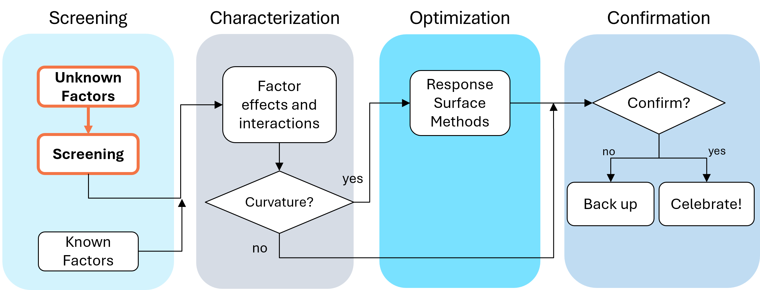
Fig. 1: Where screening fits in the SCOR strategy of experimentation.
With this strategy in view, here are the core do's and don'ts on screening designs. Consider this your field guide for avoiding the most common (and costly) mistakes.
DON'T: Include Factors You Already Know Will Affect the Process
This one surprises a lot of people, and has been the topic of heated discussions within our team. Why would you exclude a known important factor?
The answer is strategic focus and efficiency. By setting known factors aside during screening, you can concentrate on previously unknown factors: ones that might derail your process in unexpected ways. A broad and shallow two-level screening design lets you quickly identify the "vital few" from the "trivial many." In our experience, roughly 20% of factors you didn't expect to matter, matter! The known factors can be merged back in during the next phase of experimentation.
DON'T: Use Low Resolution Designs for Screening
This is our biggest pet peeve. Two types of designs fall into this trap: regular fractional factorials at Resolution III (shown as "red" designs in Stat-Ease software[MA3.1]), which alias main effects directly with two-factor interactions, and Plackett-Burman designs with even worse aliasing. That's a fatal flaw for screening, because if any factors interact (and in real processes, they often do) your main effect estimates are corrupted. You simply cannot trust what the analysis is telling you.
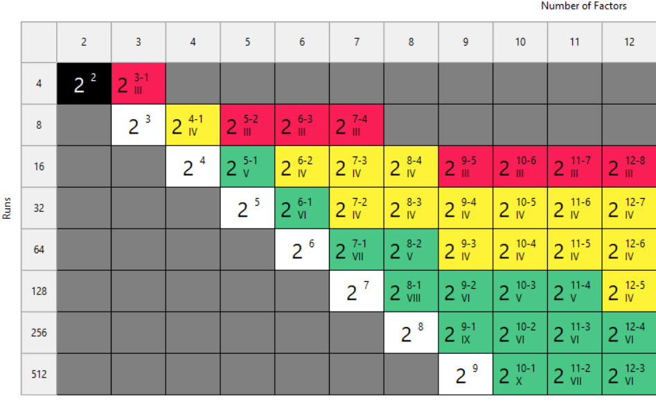
Fig. 2: Stat-Ease software's design picker, color-coded for your convenience.
We're particularly troubled by how often Plackett-Burman designs get recommended for screening. Even the NIST Engineering Statistics Handbook suggests using them, while simultaneously noting that “main effects are in general heavily confounded with two-factor interactions.” To us, that's an oxymoron. If main effects are confounded with two-factor interactions, how exactly is this a screening design? You can’t screen anything out!
To illustrate the danger, we ran a simulation using the classic filtration rate dataset from Doug Montgomery's textbook Design and Analysis of Experiments. The full factorial result was clear: factors A (temperature), C (concentration), and D (stirring rate) were significant, along with strong AC and AD interactions.
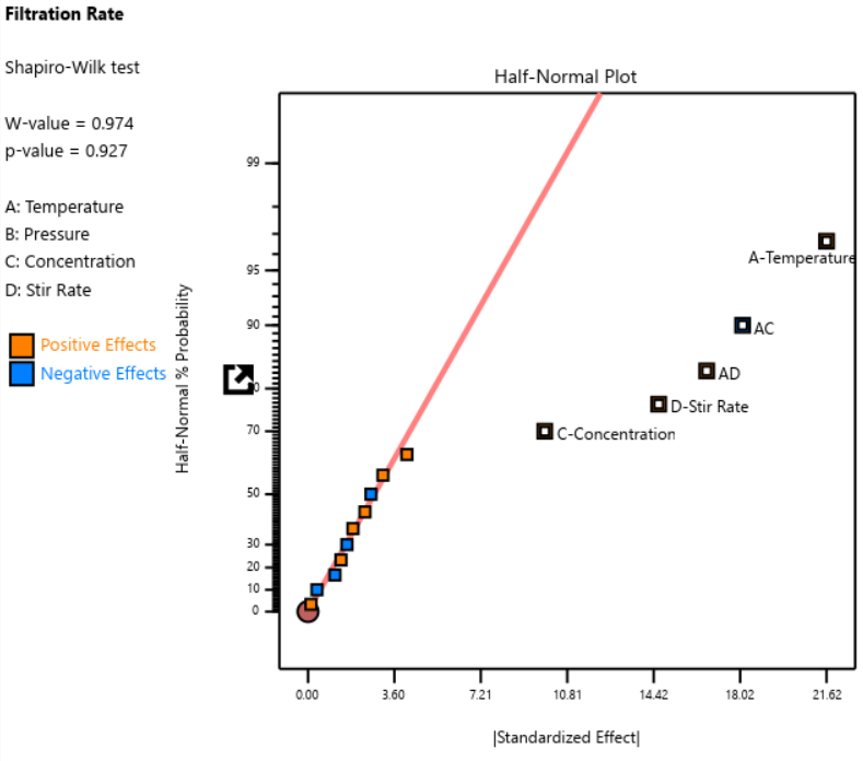
Fig. 3: Half-normal plot of effects for the full factorial design. Note that the selected effects are to well the right of the guideline.
When we re-ran the same underlying model through a 12-run Plackett-Burman simulation, the results were alarming. The AC and AD interactions got “smeared out” across multiple dummy factors. In particular, a fake factor E appeared significant when it was actually picking up aliased pieces of AC and AD. Meanwhile, the real main effect of D was undercut by its aliasing with one-third of AC, causing a cancellation. The result? Only factor A was correctly identified. Factors C and D were missed entirely.
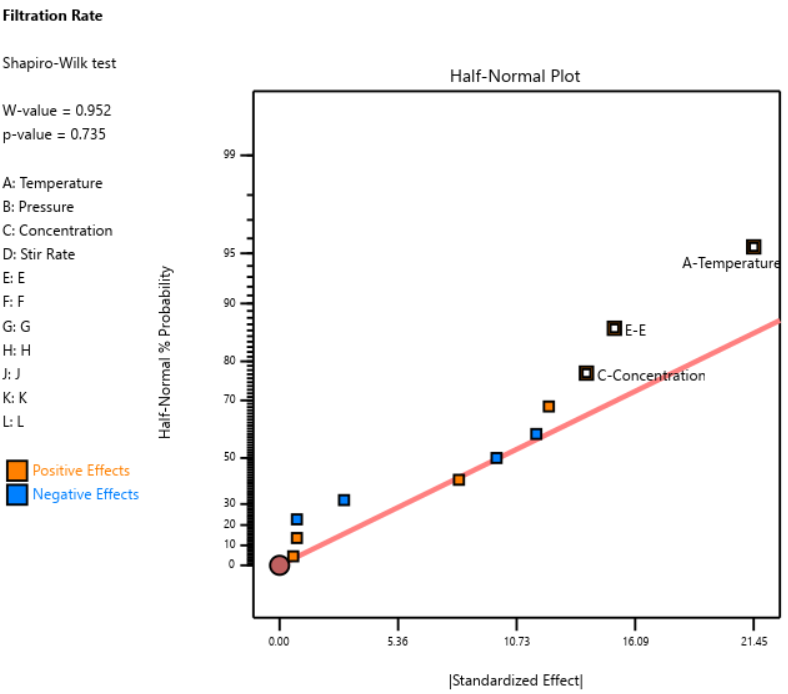
Fig. 4: Half-normal plot of effects for the Plackett-Burman design. None of the effects are to the right of the line, meaning this experiment shows no significant factors or interactions.
DOE pioneer George Box once said that running Resolution III or PB designs are "like kicking the TV to make it work." Sometimes you're desperate enough to try it, but there’s no guarantee you’ll get a usable result.
A Case Study in What NOT to Do
One of our users, a pharmaceutical process developer, sent in his design results hoping we could help salvage them. He had seven factors (time, temperature, and related process variables) and chose a Resolution III design with seven factors in eight runs. This is known as a ‘saturated’ design—the most factors that can be crammed into a given number of runs in a regular fractional factorial. Then, apparently recognizing the power would be low, he replicated the design, giving him 16 runs total, still at Resolution III.
As Ronald Fisher put it, a statistician is more like a pathologist than a medical doctor. We can tell you what killed the patient, but we can't bring it back to life. We wish this researcher had contacted us before running the design. The 16-run Resolution IV option for seven factors was right there in the software, highlighted in yellow (indicating a design more suitable for screening) It would have given him both the power and the resolution he needed. Instead, he replicated a bad design, which is a bit like making a photocopy of a photocopy.
The power calculations for these two designs are the clincher. One replicate of eight runs gave only 50% power to detect his specified signal-to-noise ratio of 1.67. Two replicates (still Resolution III) pushed that to about 87%: good power, terrible resolution. The unreplicated Resolution IV design in 16 runs also reached about 83% power, while giving him a design that could actually distinguish main effects from interactions.
DO: Start with a Resolution IV Design
As stated above, Resolution IV is the “Goldilocks” choice for screening. Main effects are aliased only with three-factor interactions, which are rarely active. That means that any significant main effects detected are almost certainly real. While two-factor interactions in a Res IV design may be murky, you'll know to investigate these further.
In Stat-Ease software, these are the yellow designs in the Regular Two-Level design builder. For up to eight factors, these medium resolution designs work beautifully. For nine or more factors, Stat-Ease’s proprietary, optimally templated, Minimum-Run screening design provides an excellent option when the standard design alternatives get too big.
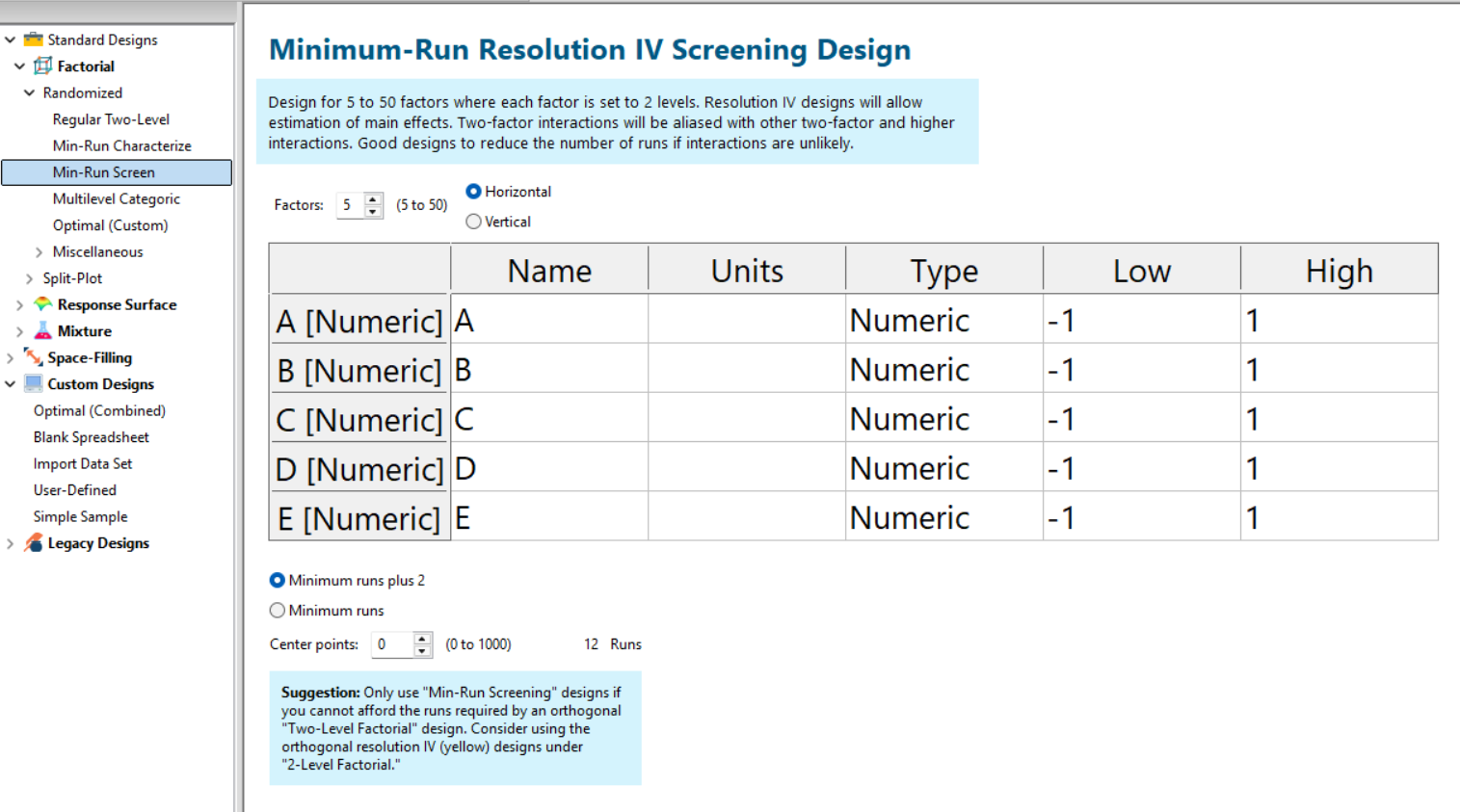
Fig. 5: Min-Run Screening designs in Stat-Ease software. Choose them from the sidebar on the left.
Summary: The Screening Do's and Don'ts
To recap: hold known factors aside during screening and focus on the unknowns. Known factors will be studied together with the survivors of the screening design in the next round of experimentation when characterizing two-factor interactions with high-resolution designs. Avoid low-resolution designs: the red standard ones or Plackett-Burmans. Instead, go with medium Resolution IV or minimum run screening design from the start.
All Stat-Ease software licensees have access to our DOE experts. We encourage you to contact us before making a big mistake in your design of experiments. Don’t hesitate to reach out: do your screening right the first time.
Like the blog? Never miss a post - sign up for our blog post mailing list.
Thinking Outside the Box by Using Standard Error to Constrain Optimization
Response surface methods (RSM) pave the way to the pinnacle of process improvement. However, the central composite design (CCD)—the most common layout for RSM (pictured in Figure 1 for three factors)—traditionally limits the region of prediction to the cubical core. This conservative view avoids dangerous extrapolation out to the far reaches of the space defined by the axial ranges of the star points. This article lays out a less-limiting (but still reasonably safe) approach to optimization based on using a specified standard error (SE) of prediction as the boundary for searching out the optimal process setup.
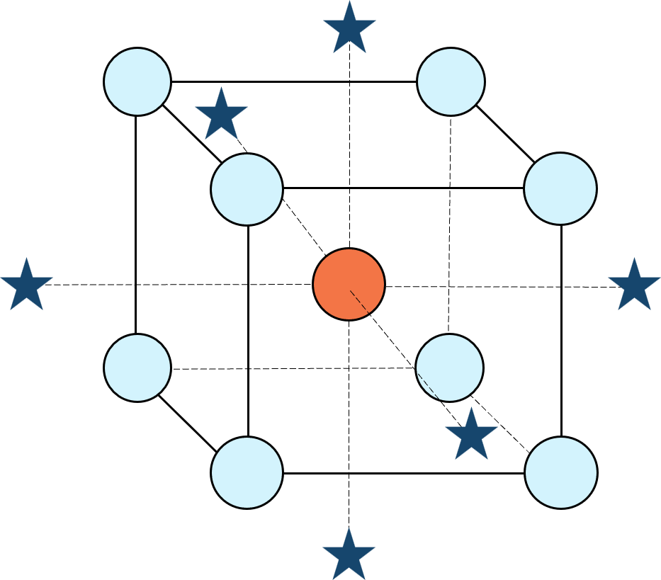
Figure 1: Central composite design for three factors
Three different methods for defining the search area will be detailed for a four-factor CCD. The goal is to avoid extrapolating beyond where the data provides adequate knowledge about the response while maximizing the volume that will be explored.
Let’s compare three boundaries for defining the search area in the factor space, the first two of which do not make use of the SE:
1. Factorial bounded—the hypercube* with vertices at coded values ±1, thus each edge spans 2 coded units. The volume of this four-dimensional hypercube is 16 (=2x2x2x2). The maximum SE is 0.764, which occurs at the vertices (i.e., corners). See figure 2. For comparison’s sake, we will use this SE (0.764) as our benchmark—anything more than this will be deemed unacceptable.
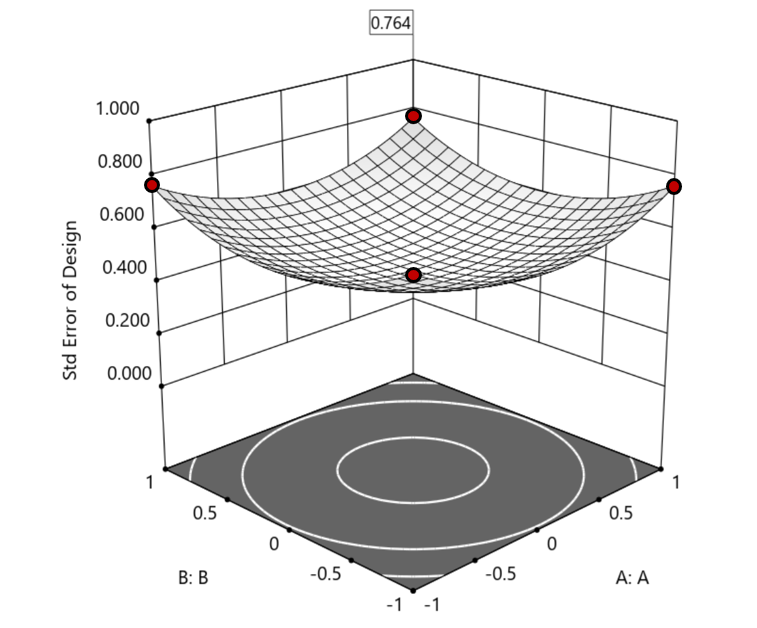
Figure 2. Looking only at the factorial region (±1), with factors C and D set to +1, we see that the highest SE values observed are at the factorial corners.
2. Axial (star-point) bounded—a cube with vertices at ±2 to include the star runs.
The volume of this four-dimensional hypercube is huge: 256 coded units (=4x4x4x4), which offers big advantages for optimization. However, most of the volume (69%) exhibits an SE ≥ 0.764 (maximum is 2.963!). Therefore, this method must be rejected. See figure 3.
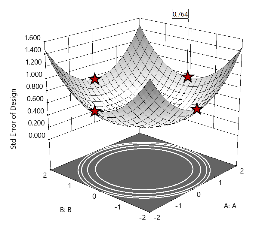
Figure 3. The default axial point placement is at ±2, which for 4 factors creates a rotatable design. The axial points therefore have the same SE as the factorial corner points—all are equidistant from the center. Note that factors C and D are set to zero (center) and the range for factors A and B are increased to ±2 to show the axial points.
3. Standard error bounded—the area within SE ≤0.764.*
Once again looking at figure 3, the SE at the axial (star) points equals that of the ±1 factorial points. Limiting the standard error ≤0.764 produces a hypersphere with a radius of 2. The volume of this hypersphere is 78.96, almost five times larger than the ±1 factorial hypercube.
Summarizing the three methods of defining the search area in the factor space:
- The factorial cube with vertices at ±1 may be too restrictive and may not include all the volume where acceptable predictions could be made.
- A cube with vertices at ±2 that includes the axial runs is too liberal; most of the volume has poor predictions.
- Defining the search area by standard error may prove insightful—it includes all the areas where acceptable predictions may reside.
Using standard error to constrain the optimization defines a search area that matches its properties:
- Spheres for rotatable CCDs. (Note: The above graphics and discussion assumed the choice of alpha values produced a spherical standard error plot).
- Cubes for face-centered CCDs.
- Irregular shapes for central composite designs with alpha between 1 and that recommended for rotatable designs, optimal designs, models for which model reduction was applied, and historical data.
An added bonus to using SE is that it adjusts the search area for reduced models and/or missing data.
It should be noted that it is assumed the design was sized for precision and contains enough data to make sound predictions within the cube (or hypercube). If the FDS is low (for example, below 80%), then making good predictions within the cube is already challenged. Extending the search zone outside the cube would exacerbate things further.
Another caveat is the assumption that a quadratic model pertains outside the design cube. The primary purpose of axial points in a central composite design is to fortify the estimates of quadratic terms to be applied within the cube. Sometimes the specified quadratic model performs well inside the cube, but extrapolation becomes dangerous due to higher-order behavior beyond the faces of the cube. Checking the diagnostic plots for anomalous behavior of the axial points can provide some assurance that the quadratic model is useful beyond the cube.
So, the key takeaway is this. Adding standard error to the search criteria and expanding the factor ranges beyond the edges of the factorial cube can be helpful for making judicious extrapolations beyond the edges of the cube. Simply applying the highest standard error found within the cube to regions outside the cube is a reasonable place to start, especially when the FDS performance of the design is over 80%. It is advisable to treat any interesting discoveries as tentative until verified by confirmation runs, augmented designs, or an entirely new design focused on the projected area of interest.
For more information on how to include standard error in the optimization module, see: Extrapolating a Response Surface Design in the Stat-Ease software Help menu.
*For 3 factors we can envision the factorial design space as a cube. With more than 3 factors (in this case 4 factors) we refer to the analogous region as a hypercube.
Acknowledgement: This post is an update of an article by Pat Whitcomb of the same title, published in the April 2017 STATeaser.
Like the blog? Never miss a post - sign up for our blog post mailing list.
Are optimal response surface method (RSM) designs always the optimal choice?
Most people who have been exposed to design of experiment (DOE) concepts have probably heard of factorial designs—designs that target the discovery of factor and interaction effects on their process. But factorial designs are hardly the only tool in the shed. And oftentimes to properly optimize our system a more advanced response surface design (RSM) will prove to be beneficial, or even essential.
This is the case when there is “curvature” within the design space, suggesting that quadratic (or higher) order terms are needed to make valid predictions between the extreme high/low process factor settings. This gives us the opportunity to find optimal solutions that reside in the interior of the design space. If you include center points in a factorial design, you can check for non-linear behavior within the design space to see if an RSM design would be useful (1). But which RSM options should you pick?
Let’s start by introducing the Stat-Ease® software menu options for RSM designs. Once we understand the alternatives we can better understand when which might be most useful for any given situation and why optimal designs are great—when needed.
- First on the list is the central composite design (our software default)
- Next is the Box-Behnken design
- And third is something called optimal design
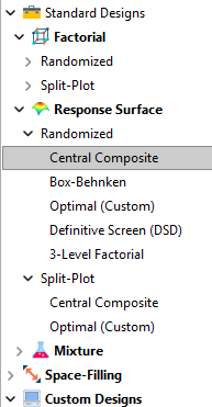
Stat-Ease software design selection options
The natural question that often pops up is this. Since optimal designs are third on our list, are we defaulting to suboptimal designs? Let’s dig in a bit deeper.
The central composite design (“CCD”) has traditionally been the workhorse of response surface methods. It has a predictable structure (5 levels for each factor). It is robust to some variations in the actual factor settings, meaning that you will still get decent quadratic model fits even if the axial runs have to be tweaked to achieve some practical values, including the extreme case when the axial points are placed at the face of the factorial “cube” making the design a 3-level study. A CCD is the design of choice when it fits the problem and generally creates predictive models that are effective throughout the design space--the factorial region of the design. Note that the quadratic predictive models generally improve when the axial points reside outside the face of the factorial cube.
When a 5-level study is not practical, for example, if we are looking at catalyst levels and the lower axial point would be zero or a negative number, we may be forced to bring the axial points to the face of the factorial cube. When this happens, Box-Behnken designs would be another standard design to consider. It is a 3-level design that is laid out slightly differently than a CCD. In general, the Box-Behnken results in a design with marginally fewer runs and is generally capable of creating very useful quadratic predictive models.
These standard designs are very effective when our experiments can be performed precisely as scripted by the design template. But this is not always the case, and when it is not we will need to apply a more novel approach to create a customized DOE.
Optimal designs are “custom” creations that come in a variety of alphabet-soup flavors—I, D, A, G, etc. The idea with optimal designs is that given your design needs and run-budget, the optimization algorithm will seek out the best choice of runs to provide you with a useful predictive model that is as effective as possible. Use of the system defaults when creating optimal designs is highly advised. Custom optimal designs often have fewer runs than the central composite option. Because they are generated by a computer algorithm, the number of levels per factor and the positioning of the points in the design space may be unique each time the design is built. This may make newcomers to optimal designs a bit uneasy. But, optimal designs fill the gap when:
- The design space is not “cuboidal”— there are constraints on the operating region that make the design space lopsided or truncated.
- There are categoric or discrete numeric factors to deal with.
- The expected polynomial model is something other than a full quadratic.
- You are trying to augment an existing design to expand the design space or to upgrade to a higher order model.
The classic designs provide simple and robust solutions and should always be considered first when planning an experiment. However, when these designs don’t work well because of budget or practical design space constraints, don’t be afraid to go “outside the box” and explore your other options. The goal is to choose a design that fits the problem!
Acknowledgement: This post is an update of an article by Shari Kraber on “Modern Alternatives to Traditional Designs Modern Alternatives to Traditional Designs" published in the April 2011 STATeaser.
(1) See Shari Kraber’s blog post, “"Energize Two-Level Factorials - Add Center Points!” from August. 23, 2018 for additional insights.
Like the blog? Never miss a post - sign up for our blog post mailing list.
Tips and tricks for designing statistically optimal experiments
Like the blog? Never miss a post - sign up for our blog post mailing list.
A fellow chemical engineer recently asked our StatHelp team about setting up a response surface method (RSM) process optimization aimed at establishing the boundaries of his system and finding the peak of performance. He had been going with the Stat-Ease software default of I-optimality for custom RSM designs. However, it seemed to him that this optimality “focuses more on the extremes” than modified distance or distance.
My short answer, published in our September-October 2025 DOE FAQ Alert, is that I do not completely agree that I-optimality tends to be too extreme. It actually does a lot better at putting points in the interior than D-optimality as shown in Figure 2 of "Practical Aspects for Designing Statistically Optimal Experiments." For that reason, Stat-Ease software defaults to I-optimal design for optimization and D-optimal for screening (process factorials or extreme-vertices mixture).
I also advised this engineer to keep in mind that, if users go along with the I-optimality recommended for custom RSM designs and keep the 5 lack-of-fit points added by default using a distance-based algorithm, they achieve an outstanding combination of ideally located model points plus other points that fill in the gaps.
For a more comprehensive answer, I will now illustrate via a simple two-factor case how the choice of optimality parameters in Stat-Ease software affects the layout of design points. I will finish up with a tip for creating custom RSM designs that may be more practical than ones created by the software strictly based on optimality.
An illustrative case
To explore options for optimal design, I rebuilt the two-factor multilinearly constrained “Reactive Extrusion” data provided via Stat-Ease program Help to accompany the software’s Optimal Design tutorial via three options for the criteria: I vs D vs modified distance. (Stat-Ease software offers other options, but these three provided a good array to address the user’s question.)
For my first round of designs, I specified coordinate exchange for point selection aimed at fitting a quadratic model. (The default option tries both coordinate and point exchange. Coordinate exchange usually wins out, but not always due to the random seed in the selection algorithm. I did not want to take that chance.)
As shown in Figure 1, I added 3 additional model points for increased precision and kept the default numbers of 5 each for the lack-of-fit and replicate points.
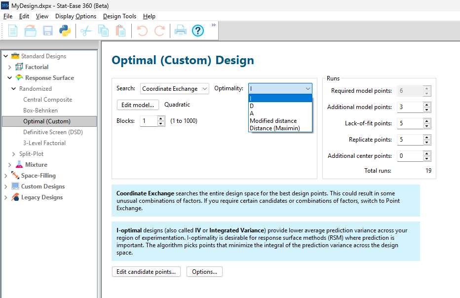
Figure 1: Set up for three alternative designs—I (default) versus D versus modified distance
As seen in Figure 2’s contour graphs produced by Stat-Ease software’s design evaluation tools for assessing standard error throughout the experimental region, the differences in point location are trivial for only two factors. (Replicated points display the number 2 next to their location.)
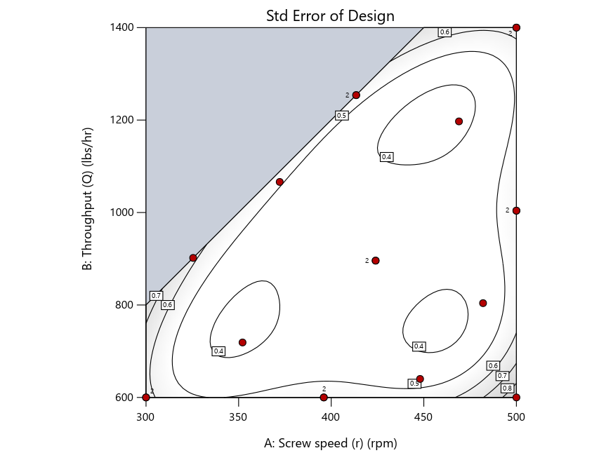
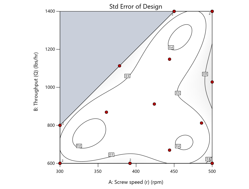
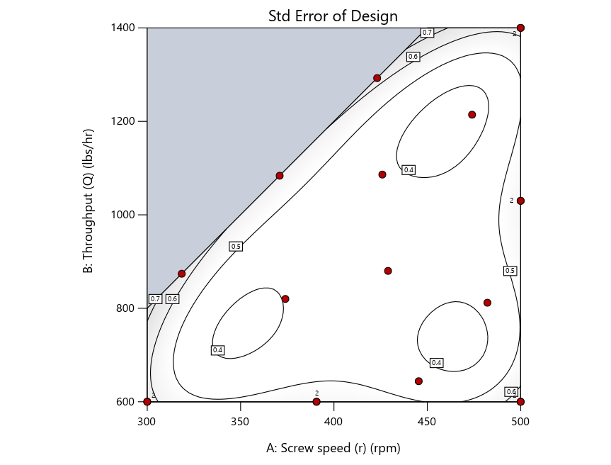
Figure 2: Designs built by I vs D vs modified distance including 5 lack-of-fit points (left to right)
Keeping in mind that, due to the random seed in our algorithm, run-settings vary when rebuilding designs, I removed the lack-of-fit points (and replicates) to create the graphs in Figure 2.

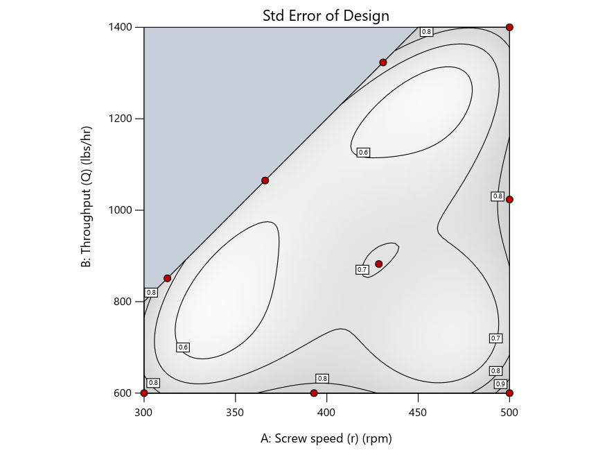
Figure 3: Designs built by I vs D vs modified distance excluding lack-of-fit points (left to right)
Now you can see that D-optimal designs put points around the outside, whereas I-optimal designs put points in the interior, and the space-filling criterion spreads the points around. Due to the lack of points in the interior, the D-optimal design in this scenario features a big increase in standard error as seen by the darker shading—a very helpful graphical feature in Stat-Ease software. It is the loser as a criterion for a custom RSM design. The I-optimal wins by providing the lowest standard error throughout the interior as indicated by the light shading. Modified distance base selection comes close to I optimal but comes up a bit short—I award it second place, but it would not bother me if a user liking a better spread of their design points make it their choice.
In conclusion, as I advised in my DOE FAQ Alert, to keep things simple, accept the Stat-Ease software custom-design defaults of I optimality with 5 lack-of-fit points included and 5 replicate points. If you need more precision, add extra model points. If the default design is too big, cut back to 3 lack-of-fit points included and 3 replicate points. When in a desperate situation requiring an absolute minimum of runs, zero out the optional points and ignore the warning that Stat-Ease software pops up (a practice that I do not generally recommend!).
A practical tip for point selection
Look closely at the I-optimal design created by coordinate exchange in Figure 3 on the left and notice that two points are placed in nearly the same location (you may need a magnifying glass to see the offset!). To avoid nonsensical run specifications like this, I prefer to force the exchange algorithm to point selection. This restricts design points to a geometrically registered candidate set, that is, the points cannot move freely to any location in the experimental region as allowed by coordinate exchange.
Figure 4 shows the location of runs for the reactive-extrusion experiment with point selection specified.
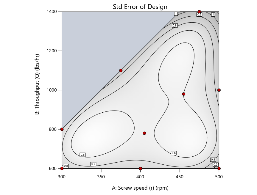
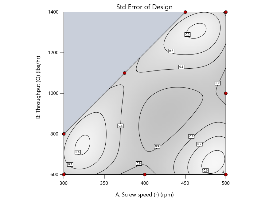
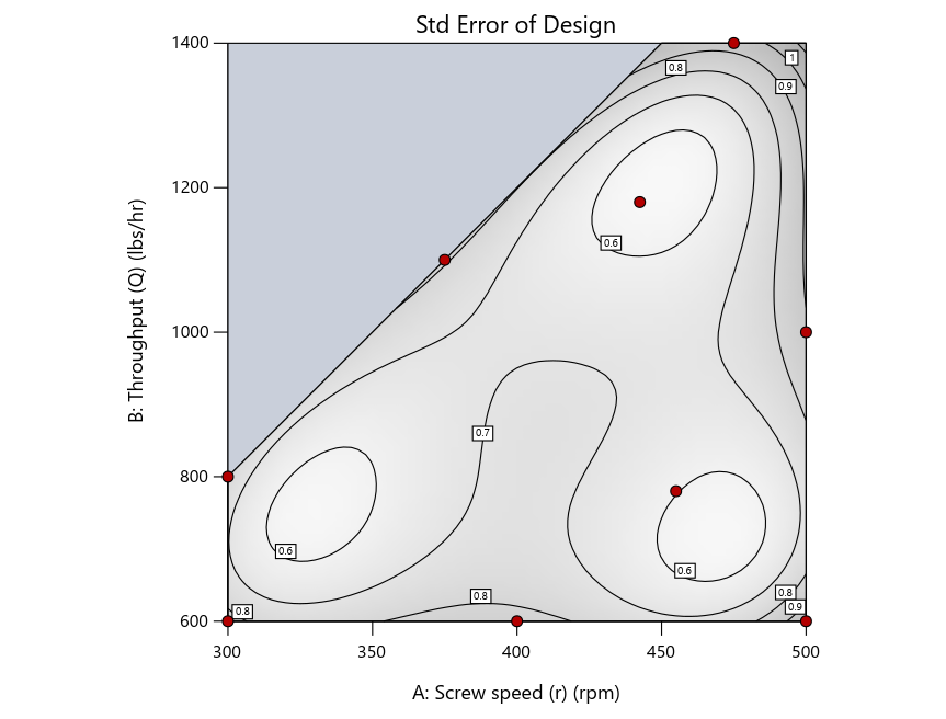
Figure 4: Designs built by I vs D vs modified distance by point exchange (left to right)
The D optimal remains a bad choice—the same as before. The edge for I optimal over modified distance narrows due to point exchange not performing quite as well for as coordinate exchange.
As an engineer with a wealth of experience doing process development, I like the point exchange because it:
- Reaches out for the ‘corners’—the vertices in the design space,
- Restricts runs to specific locations, and
- Allows users to see where they are by showing space point type on the design layout enabled via a right-click over the upper left corner.
Figures 5a and 5b illustrate this advantage of point over coordinate exchange.
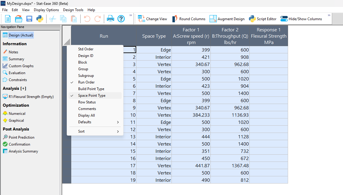
Figure 5a: Design built by coordinate exchange with Space Point Type toggled on
On the table displayed in Figure 5a for a design built by coordinate exchange, notice how points are identified as “Vertex” (good the software recognized this!), “Edge” (not very specific) and “Interior” (only somewhat helpful).
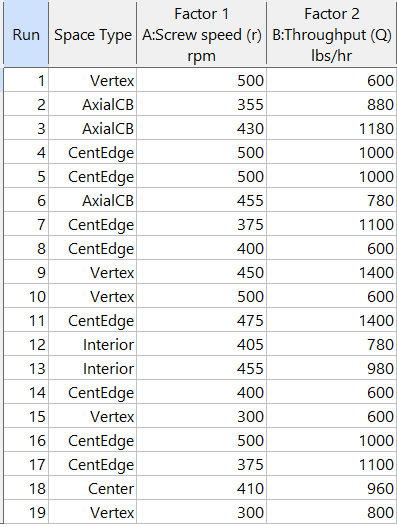
Figure 5b: Design built by point exchange with Space Point Type shown
As shown by Figure 5b, rebuilding the design via point exchange produces more meaningful identification of locations (and better registered geometrically): “Vertex” (a corner), “CentEdge” (center of edge—a good place to make a run), “Center” (another logical selection) and “Interior” (best bring up the contour graph via design evaluation to work out where these are located—click any point to identify them by run number).
Full disclosure: There is a downside to point exchange—as the number of factors increases beyond 12, the candidate set becomes excessive and thus the build takes more time than you may be willing to accept. Therefore, Stat-Ease software recommends going only with the far faster coordinate exchange. If you override this suggestion and persist with point exchange, no worries—during the build you can cancel it and switch to coordinate exchange.
Final words
A fellow chemical engineer often chastised me by saying “Mark, you are overthinking things again.” Sorry about that. If you prefer to keep things simple (and keep statisticians happy!), go with the Stat-Ease software defaults for optimal designs. Allow it to run both exchanges and choose the most optimal one, even though this will likely be the coordinate exchange. Then use the handy Round Columns tool (seen atop Figure 5a) to reduce the number of decimal places on impossibly precise settings.
Like the blog? Never miss a post - sign up for our blog post mailing list.
Salvaging a designed experiment via covariate analysis
Ideally all variables other than those included in an experiment are held constant or blocked out in a controlled fashion. However, sometimes a variable that one knows will create an important effect, such as ambient temperature or humidity, cannot be controlled. In such cases it pays to collect measurements run by run. Then the results can be analyzed with and without this ‘covariate.’
Douglas Montgomery provides a great example of analysis of covariance in section 15.3 of his textbook Design and Analysis of Experiments. It details a simple comparative experiment aimed at assessing the breaking strength in pounds of monofilament-fiber produced by three machines. The process engineer collected five samples at random from each machine, measuring the diameter of each (knowing this could affect the outcome) and testing them out. The results by machine are shown below with the diameters, measured in mils (thousandths of an inch), provided in the parentheses:
- 36 (20), 41 (25), 39 (24), 42 (25), 49 (32)
- 40 (22), 48 (28), 39 (22), 45 (30), 44 (28)
- 35 (21), 37 (23), 42 (26), 34 (21), 32 (15)
The data on diameter can be easily captured via a second response column alongside the strength measures. Montgomery reports that “there is no reason to believe that machines produce fibers of different diameters.” Therefore, creating a new factor column, copying in the diameters and regressing out its impact on strength leads to a clearer view of the differences attributed to the machines.
I will now show you the procedure for handling a covariate with Stat-Ease software. However, before doing so, analyze the experiment as planned and save this work so you can do a before and after comparison.
Figure 1 illustrates how to insert a new factor. As seen in the screenshot, I recommend this be done before the first controlled factor.

Figure 1: Inserting a new factor column for the covariate entered initially as a response
The Edit Info dialog box then appears. Type in the name and units of measure for the covariate and the actual range from low to high.

Figure 2: Detailing the covariate as a factor, including the actual range
Press “Yes” to confirm the change in actual values when the warning pops up.

Figure 3: Warning about actual values.
After the new factor column appears, the rows will be crossed out. However, when you copy over the covariate data, the software stops being so ‘cross’ (pun intended).
Press ahead to the analysis. Include only the main effect of the covariate in your model. The remainder of the terms involving controlled factors may go beyond linear if estimable. As a start, select the same terms as done before adding the covariate.
In this case, the model must be linear due to there being only one factor (machine) and it being categorical. The p-value on the effect increases from 0.0442 (significant at p<0.05) with only the machine modeled—not the diameter—to 0.1181 (not significant!) with diameter included as a covariate. The story becomes even more interesting by viewing the effects plots.

Figure 4: No covariate.

Figure 5: With covariate accounted for.
You can see that the least significant difference (LSD) bars decrease considerably from Figure 4 to Figure 5 without and with the covariate; respectively. That is a good sign—the fitting becomes far more precise by taking diameter (the covariate) into account. However, as Montgomery says, the process engineer reaches “exactly the opposite conclusion”—Machine 3 looking very weak (literally!) without considering the monofilament diameter, but when doing the covariate analysis, it becomes more closely aligned with the other two machines.
In conclusion, this case illustrates the value of recording external variables run-by-run throughout your experiment whenever possible. They then can be studied via covariate analysis for a more precise model of your factors and their effects.
This case is a bit tricky due to the question of whether fiber strength by machine differs due to them producing differing diameters, in which case this should be modeled as the primary response. A far less problematic example would be an experiment investigating the drying time of different types of paint in an uncontrolled environment. Obviously, the type of paint does not affect the temperature or humidity. By recording ambient conditions, the coating researcher could then see if they varied greatly during the experiment and, if so, include the data on these uncontrolled variables in the model via covariate analysis. That would be very wise!
PS: Joe Carriere, a fellow consultant at Stat-Ease, suggested I discuss this topic—very appealing to me as a chemical process engineer. He found the monofilament machine example, which I found very helpful (also good by seeing agreement in statistical results between our software and the one used by Montgomery).
PPS: For more advice on covariates, see this topic Help.