Stat-Ease Blog

Categories
The Do's and Don'ts for Screening Process Factors
Adapted from Mark Anderson's 2023 webinar, "Do's & Don'ts for Screening Process Factors."
Over the years working with process development engineers on scale-up and manufacturing troubleshooting, we've noticed a pattern: the factors that experts think drive their process are rarely the whole story. There are often other variables at play that nobody anticipates. The best way to uncover these is by using screening designs: broad, shallow experiments that help you uncover previously unknown factors. Done right, a well-designed screening study can transform your understanding of a process and point you directly to the vital few factors worth exploring in depth.
First, let’s make sure we understand what a screening design does in the overall arc of process optimization. Screening designs exist to help ensure we are working with the right factors in subsequent optimization studies. Figure 1 explains the overall strategy. Note that interactions – often the key to process improvement – are not identified until the subsequent step. But a good screening design can shed some light on whether or not there are interactions to further pursue.
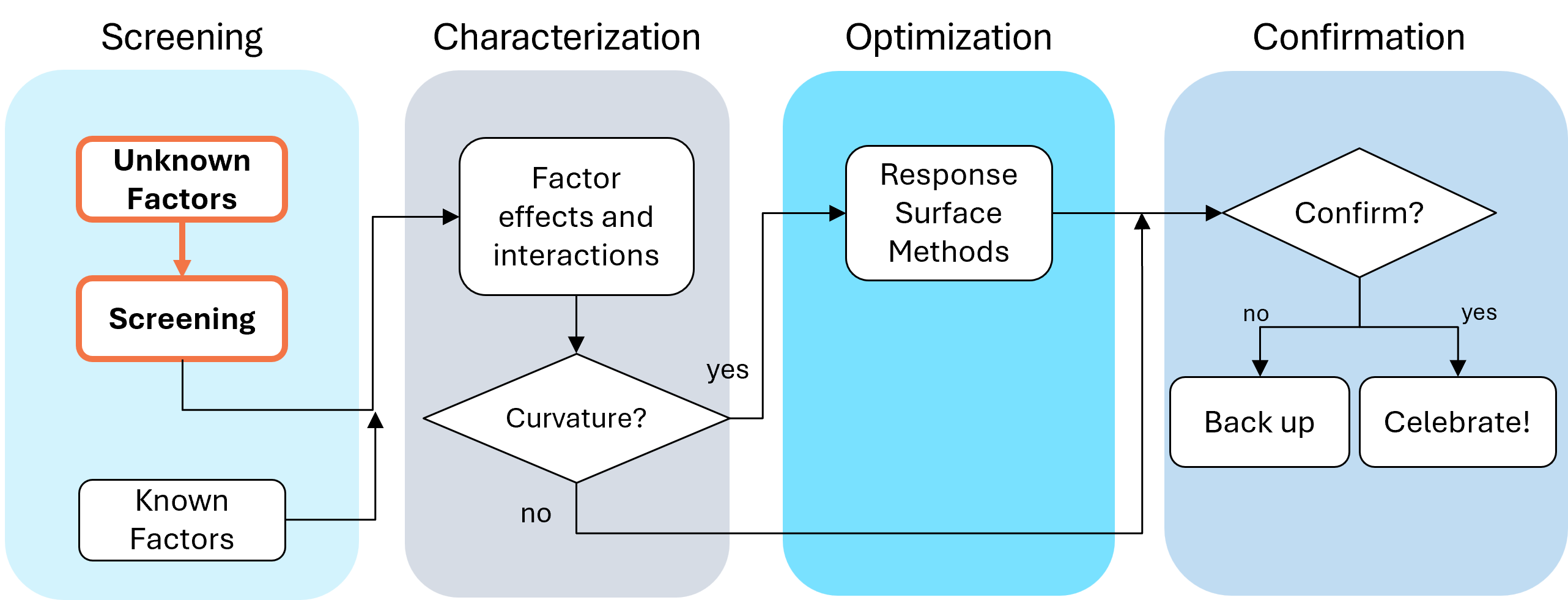
Fig. 1: Where screening fits in the SCOR strategy of experimentation.
With this strategy in view, here are the core do's and don'ts on screening designs. Consider this your field guide for avoiding the most common (and costly) mistakes.
DON'T: Include Factors You Already Know Will Affect the Process
This one surprises a lot of people, and has been the topic of heated discussions within our team. Why would you exclude a known important factor?
The answer is strategic focus and efficiency. By setting known factors aside during screening, you can concentrate on previously unknown factors: ones that might derail your process in unexpected ways. A broad and shallow two-level screening design lets you quickly identify the "vital few" from the "trivial many." In our experience, roughly 20% of factors you didn't expect to matter, matter! The known factors can be merged back in during the next phase of experimentation.
DON'T: Use Low Resolution Designs for Screening
This is our biggest pet peeve. Two types of designs fall into this trap: regular fractional factorials at Resolution III (shown as "red" designs in Stat-Ease software[MA3.1]), which alias main effects directly with two-factor interactions, and Plackett-Burman designs with even worse aliasing. That's a fatal flaw for screening, because if any factors interact (and in real processes, they often do) your main effect estimates are corrupted. You simply cannot trust what the analysis is telling you.
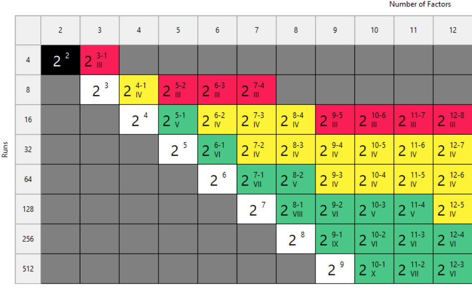
Fig. 2: Stat-Ease software's design picker, color-coded for your convenience.
We're particularly troubled by how often Plackett-Burman designs get recommended for screening. Even the NIST Engineering Statistics Handbook suggests using them, while simultaneously noting that “main effects are in general heavily confounded with two-factor interactions.” To us, that's an oxymoron. If main effects are confounded with two-factor interactions, how exactly is this a screening design? You can’t screen anything out!
To illustrate the danger, we ran a simulation using the classic filtration rate dataset from Doug Montgomery's textbook Design and Analysis of Experiments. The full factorial result was clear: factors A (temperature), C (concentration), and D (stirring rate) were significant, along with strong AC and AD interactions.
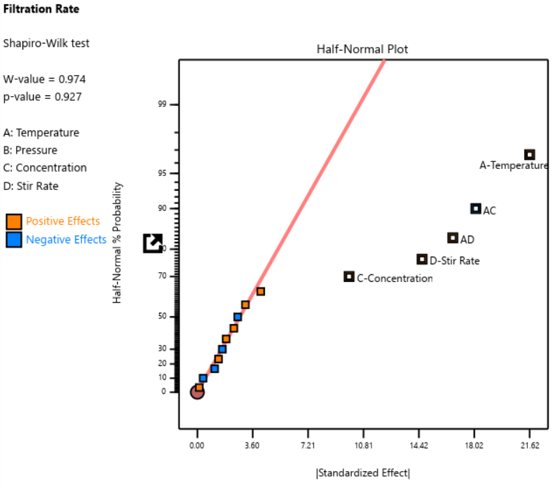
Fig. 3: Half-normal plot of effects for the full factorial design. Note that the selected effects are to well the right of the guideline.
When we re-ran the same underlying model through a 12-run Plackett-Burman simulation, the results were alarming. The AC and AD interactions got “smeared out” across multiple dummy factors. In particular, a fake factor E appeared significant when it was actually picking up aliased pieces of AC and AD. Meanwhile, the real main effect of D was undercut by its aliasing with one-third of AC, causing a cancellation. The result? Only factor A was correctly identified. Factors C and D were missed entirely.
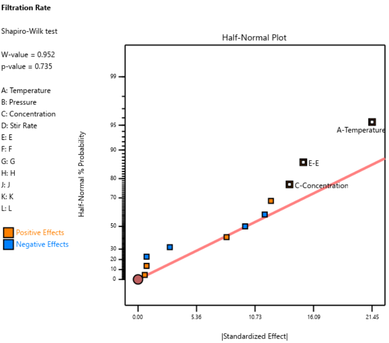
Fig. 4: Half-normal plot of effects for the Plackett-Burman design. None of the effects are to the right of the line, meaning this experiment shows no significant factors or interactions.
DOE pioneer George Box once said that running Resolution III or PB designs are "like kicking the TV to make it work." Sometimes you're desperate enough to try it, but there’s no guarantee you’ll get a usable result.
A Case Study in What NOT to Do
One of our users, a pharmaceutical process developer, sent in his design results hoping we could help salvage them. He had seven factors (time, temperature, and related process variables) and chose a Resolution III design with seven factors in eight runs. This is known as a ‘saturated’ design—the most factors that can be crammed into a given number of runs in a regular fractional factorial. Then, apparently recognizing the power would be low, he replicated the design, giving him 16 runs total, still at Resolution III.
As Ronald Fisher put it, a statistician is more like a pathologist than a medical doctor. We can tell you what killed the patient, but we can't bring it back to life. We wish this researcher had contacted us before running the design. The 16-run Resolution IV option for seven factors was right there in the software, highlighted in yellow (indicating a design more suitable for screening) It would have given him both the power and the resolution he needed. Instead, he replicated a bad design, which is a bit like making a photocopy of a photocopy.
The power calculations for these two designs are the clincher. One replicate of eight runs gave only 50% power to detect his specified signal-to-noise ratio of 1.67. Two replicates (still Resolution III) pushed that to about 87%: good power, terrible resolution. The unreplicated Resolution IV design in 16 runs also reached about 83% power, while giving him a design that could actually distinguish main effects from interactions.
DO: Start with a Resolution IV Design
As stated above, Resolution IV is the “Goldilocks” choice for screening. Main effects are aliased only with three-factor interactions, which are rarely active. That means that any significant main effects detected are almost certainly real. While two-factor interactions in a Res IV design may be murky, you'll know to investigate these further.
In Stat-Ease software, these are the yellow designs in the Regular Two-Level design builder. For up to eight factors, these medium resolution designs work beautifully. For nine or more factors, Stat-Ease’s proprietary, optimally templated, Minimum-Run screening design provides an excellent option when the standard design alternatives get too big.
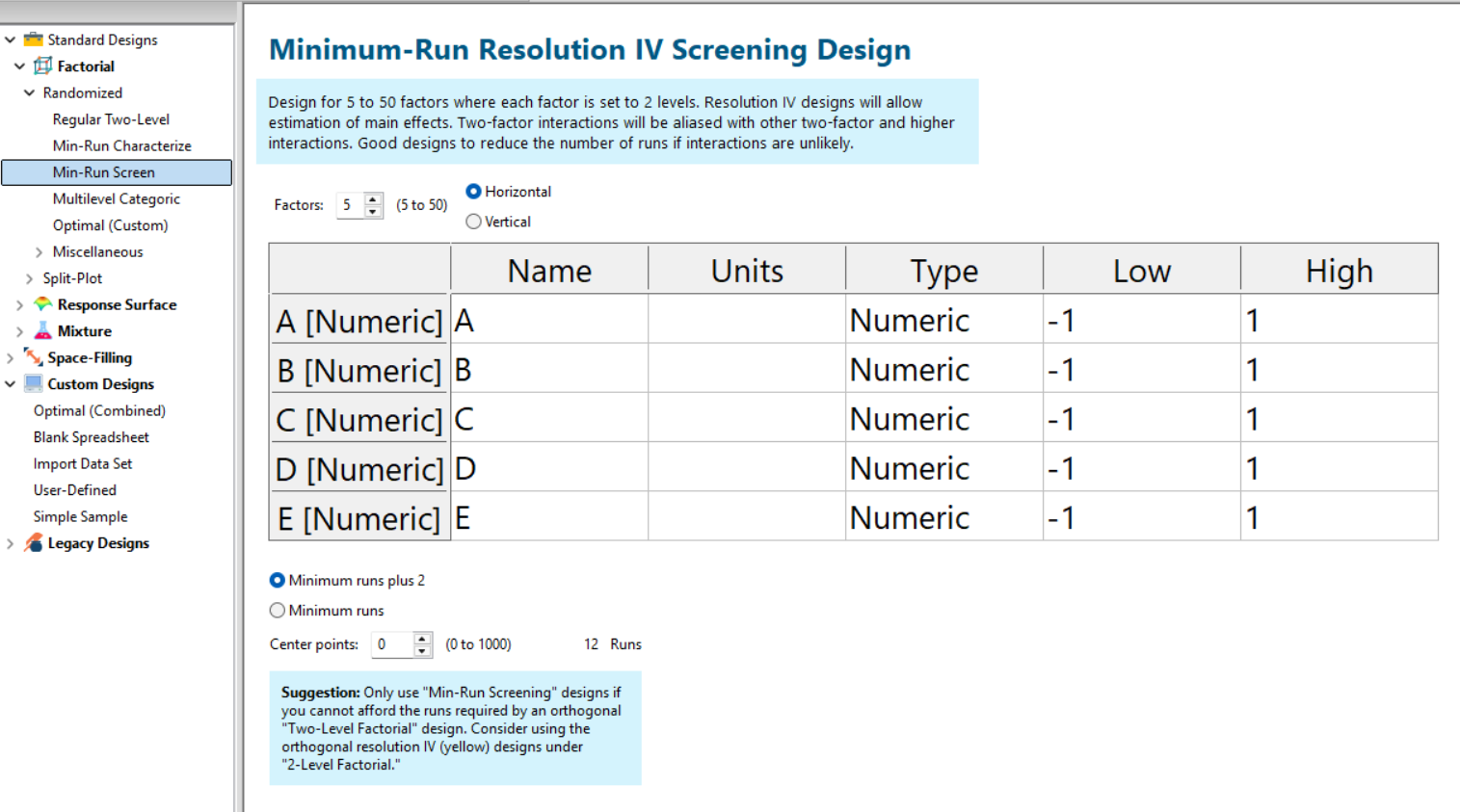
Fig. 5: Min-Run Screening designs in Stat-Ease software. Choose them from the sidebar on the left.
Summary: The Screening Do's and Don'ts
To recap: hold known factors aside during screening and focus on the unknowns. Known factors will be studied together with the survivors of the screening design in the next round of experimentation when characterizing two-factor interactions with high-resolution designs. Avoid low-resolution designs: the red standard ones or Plackett-Burmans. Instead, go with medium Resolution IV or minimum run screening design from the start.
All Stat-Ease software licensees have access to our DOE experts. We encourage you to contact us before making a big mistake in your design of experiments. Don’t hesitate to reach out: do your screening right the first time.
Like the blog? Never miss a post - sign up for our blog post mailing list.
Mixture Designs – Gimmick or Magic?
Years ago, I attended Stat-Ease’s Modern DOE workshop in Minneapolis—a five day deep dive into factorial and response surface methods (RSM). I then completed a four day course on Mixture Design for Optimal Formulations. Since then, I’ve trained practitioners and coached users through hundreds of experiments. One pattern is consistent: most people—myself included—gravitate toward familiar factorial or RSM designs and hesitate to use mixture designs for formulation work.
The result is force-fitting RSM tools onto mixture problems. Like using a flathead screwdriver on a Phillips screw, it can work, but it’s rarely ideal. And, avoiding mixture designs can actually create real problems. So, what makes mixtures unique, and what goes wrong when we ignore that?
Why Mixtures Are Different
In mixtures, ratios drive responses, not absolute amounts. The flavor of a cookie depends on the ratio of flour, sugar, fat, and salt; not the grams of sugar alone. And because mixture components must sum to a total (often 100%), choosing levels for some ingredients automatically constrains the rest.
The Ratio Workaround—and Its Limits
A common workaround is to convert a q-component mixture into q-1 ratios and run a standard RSM design¹. For example, suppose we’re formulating a sweetener blend (A = sugar, B = corn syrup, C = honey) that always makes up 10% of a cookie recipe. If we express the system using ratios B:A and C:A, we can build a two factor RSM design with ratio levels like 1:1, 2:1, and 3:1.
But compared to a true three component mixture design, the difference is clear. The ratio based design samples only narrow rays of the mixture space, leaving large regions unexplored. Standard error plots show that a proper mixture design provides far better prediction capability across the full region.
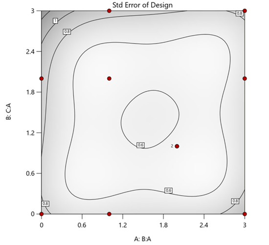
Figure 1. Optimal 10-run RSM design layout using two ratios for a three-component mixture. The shading conveys the relative standard error: lighter is lower, darker is higher.
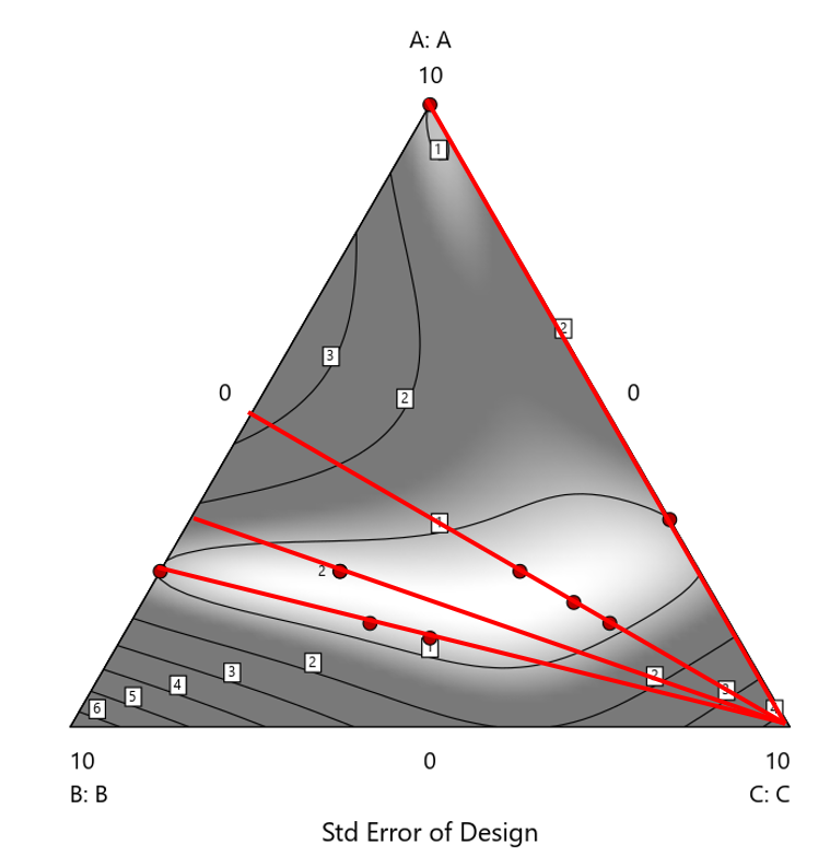
Figure 2. Translation of the ratio design from Figure 1 onto a three-component layout.
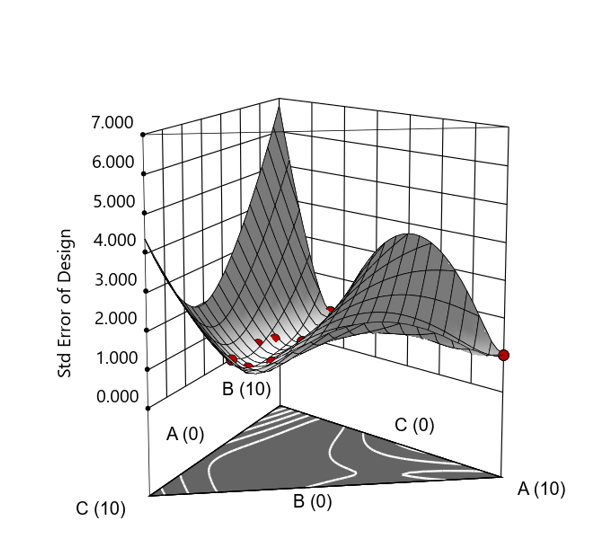
Figure 3. Standard error 3D plot of the 10-run ratio design.
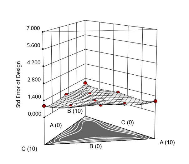
Figure 4. Standard error 3D plot for a 10-run augmented simplex mixture design.
In short: the ratio trick can work, but it never matches the statistical properties of a proper mixture design.
The Slack Component Argument
Another justification for using RSM is when one ingredient is believed to be inconsequential. Perhaps the component is believed to be inert or is simply a diluent that makes up the balance of a formulation. The idea is to treat this component as a slack variable and allow it to fill whatever space remains after setting the other ingredients. One slack approach is to simply use the upper and lower values as levels of the non slack components in a standard RSM. Below is a comparison of a three-component system analyzed as a true mixture design alongside a two-factor RSM that eliminates the diluent as a component.
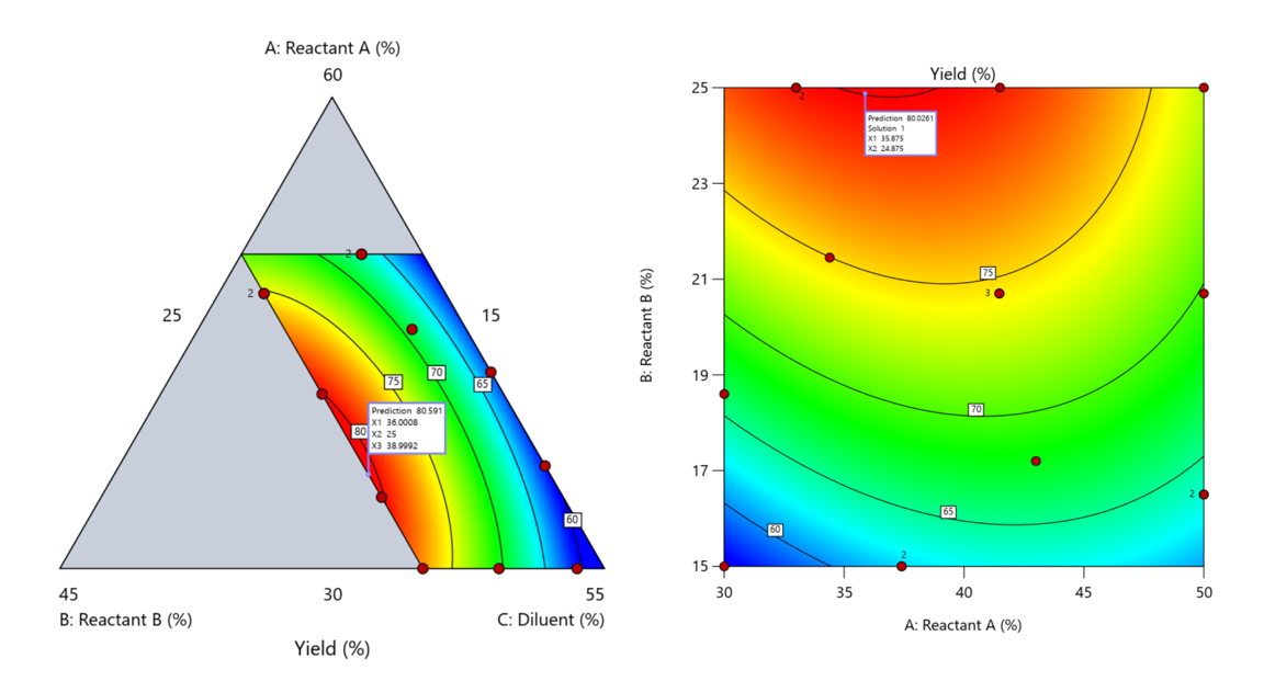
Figure 5. Optimization comparison of a three component mixture design and a two factor (component) RSM approach
In this case, both approaches found essentially the same optimal conditions. Ignoring the diluent really didn’t impact the story, but the RSM approach is not specifically assessing the interactive behavior between the reactants and the diluent. If we study the system as an RSM, we assume the interactions involving the omitted component were not consequential—which may not be true. Cornell² states that the factor effects we are seeing are actually the effects confounded with the opposite effect of the ignored component. Without using a mixture design, we would have no way of validating our assumptions about these interactions.
Cornell³ also describes an alternative slack approach where the slack component is included in the design but excluded from the predictive model. Some practitioners believe this approach makes sense when the diluent interacts weakly with the key ingredients, the omitted component is the one with the widest range of proportionate values, or if that component makes up the bulk of the formulation. But statistically, this presents some interesting complexities.
Using the above chemical reaction example, Figure 6 shows the model differences between the Scheffé approach and the resulting models when each component is considered the slack component.
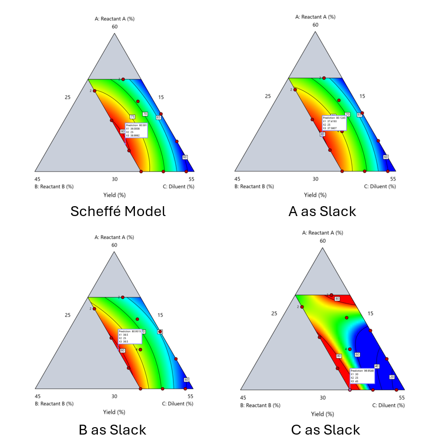
Figure 6. Comparing the Scheffé and Slack modeling techniques.
Note that in this example, while some of the models are similar, the one involving the diluent as the slack variable differs most from the Scheffé standard. Had we assumed the diluent could have been used as the slack variable, we would have poorly modeled and optimized the system.
Because slack variable models exclude at least one component and its interactions, they’re best avoided when possible.
When Components Don’t Share a Scale
Mixture designs require all components to share a common basis (percent, ppm, etc.). This becomes awkward when ingredients span vastly different scales—for example, large amounts of reactants plus a catalyst at ppm levels. The phenomenon is often called the “sliver effect” because the design space becomes a very narrow region for the low-level component, as shown in Figure 7.
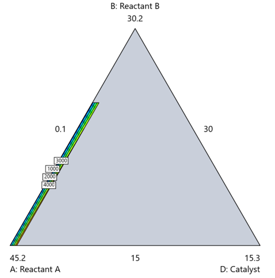
Figure 7. The sliver effect that can occur when one component is present in much lower levels than the balance of the formulation.
One way to avoid a sliver is to change the metric: in this case, changing to molar percent may put the components on a comparable basis and all components could have been included in the mixture design. Or, if I’m still avoiding mixtures, a practical solution is a combined design: treat the main ingredients as a mixture and the catalyst as a process variable. Both the mixture and the catalyst should be modeled quadratically to capture interactions. However, the interactive nature of components is best resolved when all ingredients are included in the mixture design.
The Bottom Line
For formulations, and recipes, the best results come from designs built specifically for mixtures. They’re not gimmicks or magic; they’re the right tools for the job. Stat-Ease provides tutorials and webinars to help you get started:
- A Crash Course in Mixture Design of Experiments
- Optimal experiment designs that combine mixture, process and categorical inputs
Or, if you’d prefer a hands-on, instructor-led experience (maybe with me!), sign up for one of the following courses:
References:
- Response Surface Methodology, 4th edition, Myers, Montgomery, Anderson-Cook, pp. 759-763 (Wiley).
- Experiments with Mixtures, 3rd edition, John Cornell, p. 16 (Wiley).
- Experiments with Mixtures, 3rd edition, John Cornell, p. 333-343 (Wiley).
Like the blog? Never miss a post - sign up for our blog post mailing list.
Tips and tricks for designing statistically optimal experiments
Like the blog? Never miss a post - sign up for our blog post mailing list.
A fellow chemical engineer recently asked our StatHelp team about setting up a response surface method (RSM) process optimization aimed at establishing the boundaries of his system and finding the peak of performance. He had been going with the Stat-Ease software default of I-optimality for custom RSM designs. However, it seemed to him that this optimality “focuses more on the extremes” than modified distance or distance.
My short answer, published in our September-October 2025 DOE FAQ Alert, is that I do not completely agree that I-optimality tends to be too extreme. It actually does a lot better at putting points in the interior than D-optimality as shown in Figure 2 of "Practical Aspects for Designing Statistically Optimal Experiments." For that reason, Stat-Ease software defaults to I-optimal design for optimization and D-optimal for screening (process factorials or extreme-vertices mixture).
I also advised this engineer to keep in mind that, if users go along with the I-optimality recommended for custom RSM designs and keep the 5 lack-of-fit points added by default using a distance-based algorithm, they achieve an outstanding combination of ideally located model points plus other points that fill in the gaps.
For a more comprehensive answer, I will now illustrate via a simple two-factor case how the choice of optimality parameters in Stat-Ease software affects the layout of design points. I will finish up with a tip for creating custom RSM designs that may be more practical than ones created by the software strictly based on optimality.
An illustrative case
To explore options for optimal design, I rebuilt the two-factor multilinearly constrained “Reactive Extrusion” data provided via Stat-Ease program Help to accompany the software’s Optimal Design tutorial via three options for the criteria: I vs D vs modified distance. (Stat-Ease software offers other options, but these three provided a good array to address the user’s question.)
For my first round of designs, I specified coordinate exchange for point selection aimed at fitting a quadratic model. (The default option tries both coordinate and point exchange. Coordinate exchange usually wins out, but not always due to the random seed in the selection algorithm. I did not want to take that chance.)
As shown in Figure 1, I added 3 additional model points for increased precision and kept the default numbers of 5 each for the lack-of-fit and replicate points.
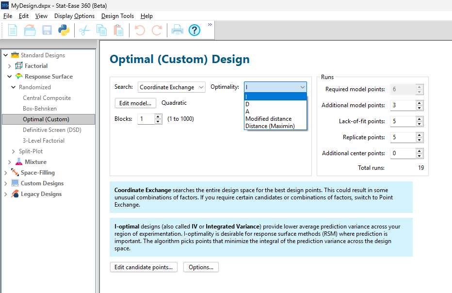
Figure 1: Set up for three alternative designs—I (default) versus D versus modified distance
As seen in Figure 2’s contour graphs produced by Stat-Ease software’s design evaluation tools for assessing standard error throughout the experimental region, the differences in point location are trivial for only two factors. (Replicated points display the number 2 next to their location.)
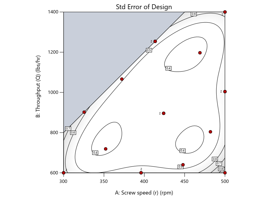
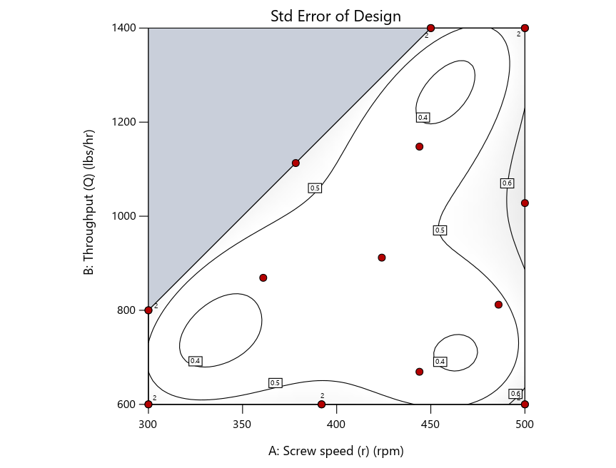
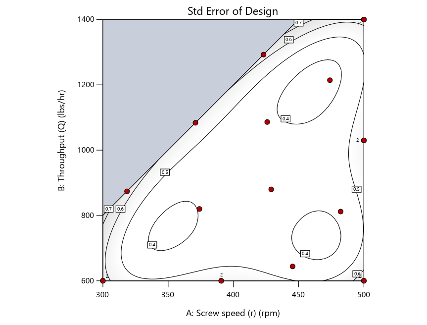
Figure 2: Designs built by I vs D vs modified distance including 5 lack-of-fit points (left to right)
Keeping in mind that, due to the random seed in our algorithm, run-settings vary when rebuilding designs, I removed the lack-of-fit points (and replicates) to create the graphs in Figure 2.
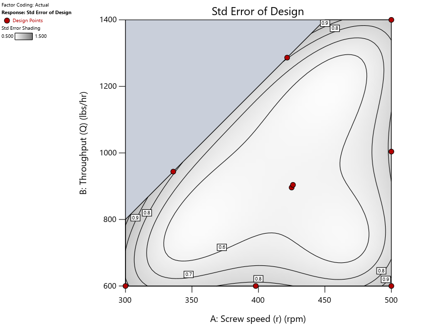

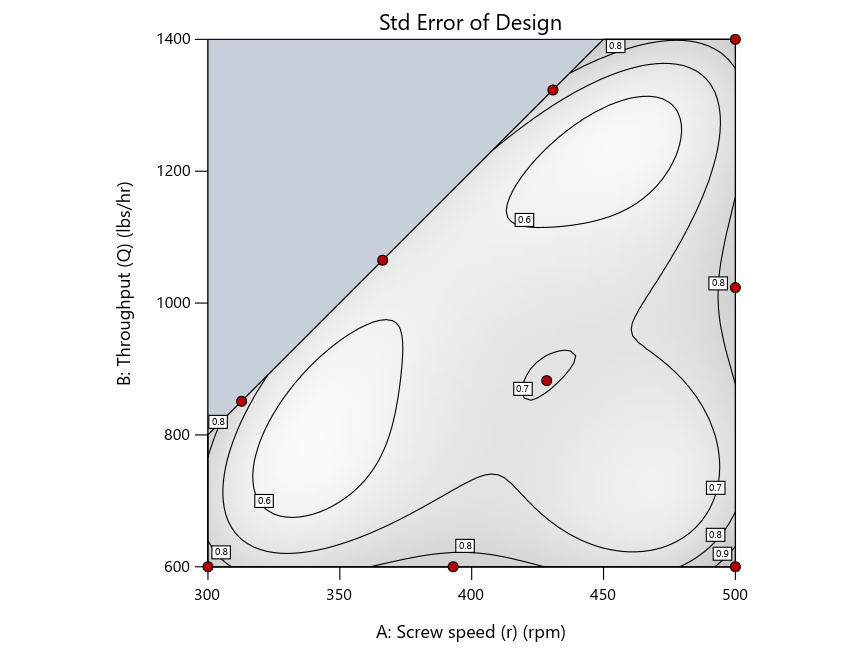
Figure 3: Designs built by I vs D vs modified distance excluding lack-of-fit points (left to right)
Now you can see that D-optimal designs put points around the outside, whereas I-optimal designs put points in the interior, and the space-filling criterion spreads the points around. Due to the lack of points in the interior, the D-optimal design in this scenario features a big increase in standard error as seen by the darker shading—a very helpful graphical feature in Stat-Ease software. It is the loser as a criterion for a custom RSM design. The I-optimal wins by providing the lowest standard error throughout the interior as indicated by the light shading. Modified distance base selection comes close to I optimal but comes up a bit short—I award it second place, but it would not bother me if a user liking a better spread of their design points make it their choice.
In conclusion, as I advised in my DOE FAQ Alert, to keep things simple, accept the Stat-Ease software custom-design defaults of I optimality with 5 lack-of-fit points included and 5 replicate points. If you need more precision, add extra model points. If the default design is too big, cut back to 3 lack-of-fit points included and 3 replicate points. When in a desperate situation requiring an absolute minimum of runs, zero out the optional points and ignore the warning that Stat-Ease software pops up (a practice that I do not generally recommend!).
A practical tip for point selection
Look closely at the I-optimal design created by coordinate exchange in Figure 3 on the left and notice that two points are placed in nearly the same location (you may need a magnifying glass to see the offset!). To avoid nonsensical run specifications like this, I prefer to force the exchange algorithm to point selection. This restricts design points to a geometrically registered candidate set, that is, the points cannot move freely to any location in the experimental region as allowed by coordinate exchange.
Figure 4 shows the location of runs for the reactive-extrusion experiment with point selection specified.
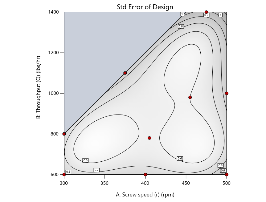
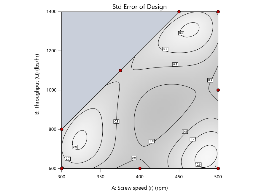
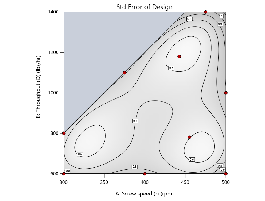
Figure 4: Designs built by I vs D vs modified distance by point exchange (left to right)
The D optimal remains a bad choice—the same as before. The edge for I optimal over modified distance narrows due to point exchange not performing quite as well for as coordinate exchange.
As an engineer with a wealth of experience doing process development, I like the point exchange because it:
- Reaches out for the ‘corners’—the vertices in the design space,
- Restricts runs to specific locations, and
- Allows users to see where they are by showing space point type on the design layout enabled via a right-click over the upper left corner.
Figures 5a and 5b illustrate this advantage of point over coordinate exchange.
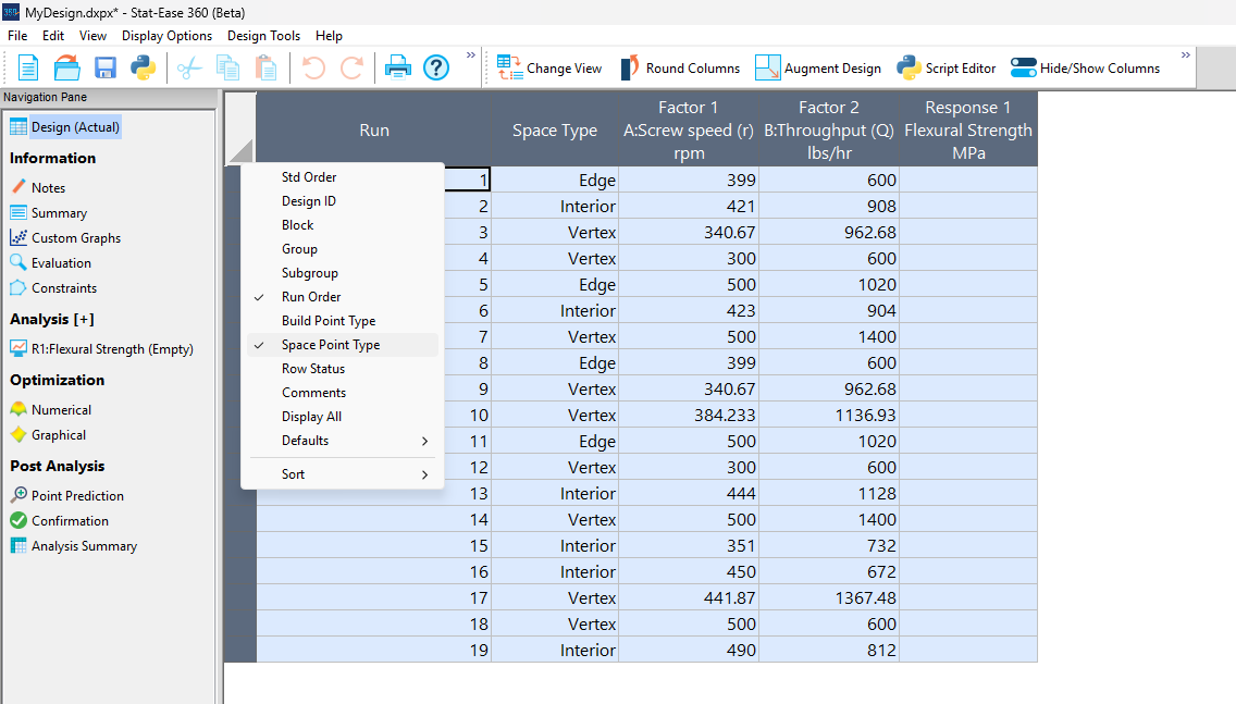
Figure 5a: Design built by coordinate exchange with Space Point Type toggled on
On the table displayed in Figure 5a for a design built by coordinate exchange, notice how points are identified as “Vertex” (good the software recognized this!), “Edge” (not very specific) and “Interior” (only somewhat helpful).
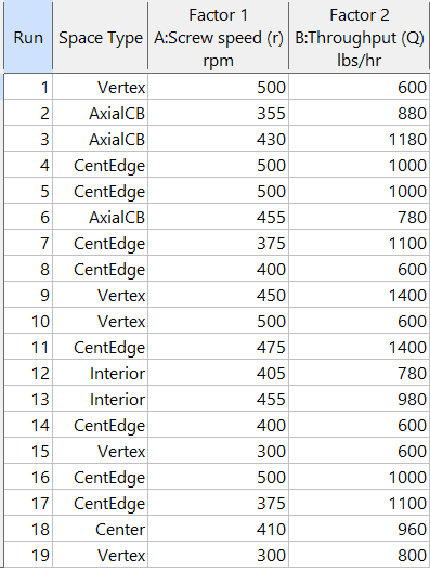
Figure 5b: Design built by point exchange with Space Point Type shown
As shown by Figure 5b, rebuilding the design via point exchange produces more meaningful identification of locations (and better registered geometrically): “Vertex” (a corner), “CentEdge” (center of edge—a good place to make a run), “Center” (another logical selection) and “Interior” (best bring up the contour graph via design evaluation to work out where these are located—click any point to identify them by run number).
Full disclosure: There is a downside to point exchange—as the number of factors increases beyond 12, the candidate set becomes excessive and thus the build takes more time than you may be willing to accept. Therefore, Stat-Ease software recommends going only with the far faster coordinate exchange. If you override this suggestion and persist with point exchange, no worries—during the build you can cancel it and switch to coordinate exchange.
Final words
A fellow chemical engineer often chastised me by saying “Mark, you are overthinking things again.” Sorry about that. If you prefer to keep things simple (and keep statisticians happy!), go with the Stat-Ease software defaults for optimal designs. Allow it to run both exchanges and choose the most optimal one, even though this will likely be the coordinate exchange. Then use the handy Round Columns tool (seen atop Figure 5a) to reduce the number of decimal places on impossibly precise settings.
Like the blog? Never miss a post - sign up for our blog post mailing list.
July Publication Roundup
Here's the latest Publication Roundup! In these monthly posts, we'll feature recent papers that cited Design-Expert® or Stat-Ease® 360 software. Please submit your paper to us if you haven't seen it featured yet!
Featured Articles
Microwave-assisted extraction of bioactive compounds from Urtica dioica using solvent-based process optimization and characterization
Scientific Reports volume 15, Article number: 25375 (2025)
Authors: Anjali Sahal, Afzal Hussain, Ritesh Mishra, Sakshi Pandey, Ankita Dobhal, Waseem Ahmad, Vinod Kumar, Umesh Chandra Lohani, Sanjay Kumar
Mark's comments: Kudos to this team for deploying a Box-Behnken response-surface-method design--convenient by only requiring 3 levels of each of their 3 factors (power, time and sample-to-solvent ratio)--to optimize their process. Given all the raw data I was able to easily copy it out and import it into my Stat-Ease software and check into the modeling--no major issues uncovered. The authors did well by diagnosing residuals and making use of our numerical optimization tools to find the most desirable factor combination for their multiple-response goals.
Be sure to check out this important study, and the other research listed below!
More new publications from July
- Improving the heterotrophic media of three Chlorella vulgaris mutants toward optimal color, biomass and protein productivity
Scientific Reports volume 15, Article number: 23325 (2025)
Authors: Mafalda Trovão, Miguel Cunha, Gonçalo Espírito Santo, Humberto Pedroso, Ana Reis, Ana Barros, Nádia Correia, Lisa Schüler, Monya Costa, Sara Ferreira, Helena Cardoso, Márcia Ventura, João Varela, Joana Silva, Filomena Freitas, Hugo Pereira - Calibration and establishment for the discrete element simulation parameters of pepper stem during harvest period
Scientific Reports volume 15, Article number: 21143 (2025)
Authors: Jiaxuan Yang, Jin Lei, Xinyan Qin, Zhi Wang, Jianglong Zhang, Lijian Lu - Design Expert Software Being Used to Explore the Factors Affecting the “Water Garden”
American Journal of Analytical Chemistry, 16, 107-116
Authors: Zelin Miu, Yichen Lu - Quality improvement of recycled carbon black from waste tire pyrolysis for replacing carbon black N330
Scientific Reports volume 15, Article number: 23726 (2025)
Authors: Tawan Laithong, Tarinee Nampitch, Peerapon Ourapeepon, Natacha Phetyim - Development and in vitro characterization of embelin bilosomes for enhanced oral bioavailability
Journal of Research in Pharmacy, Year 2025, Volume: 29 Issue: 4, 1616 - 1626, 05.07.2025
Authors: Shreya Firake Devanshi Pethani Jeet Patil Avinash Bhujbal Rahul Gondake Dhanashree Sanap , Sneha Agrawal - Performance optimization and mechanism research of C20 coal gangue concrete based on response surface and water resistance
AIP Advances, 15, 075316 (2025)
Authors: Yong Cui, Xiwen Yin, Qiuge Yu - Multi-objective optimization of boiler combustion efficiency and emissions using genetic algorithm and recurrent neural network in 660-MW coal-fired power plant
Eastern-European Journal of Enterprise Technologies, 3(8 (135), 23–33
Authors: Mohamad Arwan Efendy, Ahmad Syihan Auzani, Sholahudin Sholahudin - Optimization and characterization of polyhydroxybutyrate produced by Vreelandella piezotolerans using orange peel waste
Scientific Reports volume 15, Article number: 25873 (2025)
Authors: Mahmoud H. Hendy, Amr M. Shehabeldine, Amr H. Hashem, Ahmed F. El-Sayed, Hussein H El-Sheikh - Multi-functional electrodialysis process to treat hyper-saline reverse osmosis brine: producing high value-added HCl, NaOH and energy consumption calculation
Environmental Sciences Europe volume 37, Article number: 121 (2025)
Authors: Haia M. Elsayd, Gamal K. Hassan, Ahmed A. Affy, M. Hanafy, Tamer S. Ahmed - Quality by Design-Based Method for Simultaneous Determination of Glimepiride and Lovastatin in Self-Nano Emulsifying Drug Delivery System
Separation Science Plus, 8: e70097
Authors: Priyanka Paul, Raj Kamal, Thakur Gurjeet Singh, Ankit Awasthi, Rohit Bhatia - Sustainable Adsorbents for Wastewater Treatment: Template-Free Mesoporous Silica from Coal Fly Ash
Chemical Engineering & Technology, 48: e70077
Authors: Thapelo Manyepedza, Emmanuel Gaolefufa, Gaone Koodirile, Dr. Isaac N. Beas, Dr. Joshua Gorimbo, Bakang Modukanele, Dr. Moses T. Kabomo
June 2025 Publication Roundup
Here's the latest Publication Roundup! In these monthly posts, we'll feature recent papers that cited Design-Expert® or Stat-Ease® 360 software. Please submit your paper to us if you haven't seen it featured yet!
Featured Article
Orange-Fleshed Sweet Potatoes, Grain Amaranth, Biofortified Beans, and Maize Composite Flour Formulation Optimization and Product Characterization
Food Science and Nutrition, Volume 13, Issue 6. June 2025.
Authors: Julius Byamukama, Robert Mugabi, Dorothy Nakimbugwe, John Muyonga
Mark's comments: "It's good to see response surface methods for optimization of food recipes via mixture design. I appreciate publications that include all the data needed to assess the predictive modeling. Kudus to EU for funding research like this that alleviates malnutrition in vulnerable populations."
Be sure to check out this important study, and the other research listed below!
More new publications from June
- Optimization and induction effect evaluation of complex inducer of Aquilaria sinensis based on factorial design
Scientific Reports, volume 15, Article number: 19656 (2025)
Authors: Qiuyue Ding, Baoyi Qin, Shimin Deng, Jie Chen, Ziwei Liu, Weiping Zhou, Xiaoying Chen, Weimin Zhang, Xin Zhou, Xiaoxia Gao - Adsorption of crystal violet using thiazolium ionic liquid-crosslinked alginate hydrogels: Modelling using Box-Behnken experimental design
International Journal of Biological Macromolecules, Volume 318, Part 1, July 2025, 144951
Authors: Merve Ceylan, Jülide Hızal, Elif Nur Özer, Ivaylo Tankov, Rumyana Yankova - High-Performance Ultrathin Membrane with Molecular Arrangement Ordered for Proton Exchange Membrane
ACS Applied Polymer Materials, published June 10, 2025
Authors: Yuqing Zhang, Ailing Zhang, Kaixiang Zhou, Yongjiang Li - Impact of addition of polyvinyl chloride on the properties of clayey soil using experimental approach and optimization for geotechnical engineering applications
Scientific Reports, volume 15, Article number: 19901 (2025)
Authors: Ghania Boukhatem, Said Berdoudi, Messaouda Bencheikh, Mohammed Benzerara, Mehmet Serkan Kırgız, N. Nagaprasad, Krishnaraj Ramaswamy - Copper Corrosion in Blended Diesel-Biodiesel: Corrosion Rate Evaluation and Characterization
Chemical Engineering & Technology, e70053, 12 June 2025
Authors: Lekan Taofeek Popoola, Celestine Chidi Nwogbu, Usman Taura, Yuli Panca Asmara, Alfred Ogbodo Agbo, Paul C. Okonkwo - The Effects of Novel Thymoquinone-Loaded Nanovesicles as a Promising Avenue to Modulate Autism Associated Dysregulation by Restoring Oxidative Stress in Autism in Mice
International Journal of Nanomedicine, 24 June 2025 Volume 2025:20 Pages 8041—8061
Authors: Nermin Eissa, Jana K Alwattar, Petrilla Jayaprakash, Dana Chkier, Aala Osama Ahmed, Anum Ahmed, Rameen Rizwan, Sulthan Mujeeb, Mohamad Rahal, Bassem Sadek