Stat-Ease Blog

Categories
Four Questions that Define Which DOE is Right for You
Do you ever stare at the broad array of DOE choices and wonder where to start? Which design is going to provide you with the information needed to solve your problem? I’ve boiled this down to a few key questions. Each of them may trigger more in-depth conversation, but the answers are key to driving your design decisions.
- What is the purpose of your experiment? Typical purposes are screening, characterization, and optimization. The screening design will help identify main effects (it’s important to choose a design that will estimate main effects separately from two-factor interactions (2FI)). Characterization designs will estimate 2FI’s and give you the option to add center points to detect curvature. Optimization designs generally estimate non-linear, or quadratic effects. (See the blog “A Winning Strategy for Experimenters”.)
- Are your factors actually components in a formulation? This leads you to a mixture design. Consider this question – if you double all the components in the process, will the response be the same? If yes, then only mixture designs will properly account for the dependencies in the system. (Check out the Formulation Simplified textbook.)
- Do you have any Hard-to-Change factors? An example is temperature – it’s hard to randomly vary the temp setting higher and lower due to the time required to stabilize the process. If you were planning to sort your DOE runs manually to make it easier to run the experiment, then you likely have a hard-to-change factor. In this case, a split-plot design will give a more appropriate analysis.
- Are your factors all numeric, or all categoric, or some of each? Multilevel categoric designs work better with categoric factors that are set at more than 2 levels. A final option: optimal designs are highly flexible and can usually meet your needs for all factor types and require only minimal runs.
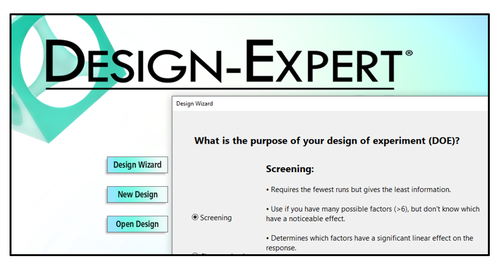
These questions, along with your budget for number of runs, will guide your decisions regarding what type of information is important to your business, and what type of factors you are using in the experiment. Conveniently, the Design Wizard in Design-Expert® software (pictured left) asks these questions, guiding you through the decision-making process, ultimately leading you to a recommended starting design.
Give it a whirl – Happy Experimenting!
A Winning Strategy for Experimenters!
A winning business strategy lays out a path with small steps that allows for changes in direction along the way. Our “SCO” flowchart for experimenters is a prime example of such a template for success. Its tried-and-true* core is screening (“S”), characterization (“C”) and optimization (“O”). However, we added one last, but perhaps most important, step: Confirmation. Let’s dive into the Stat-Ease strategy for experimenters and find out what makes it work so well.

Our starting point is the Screening design. Screening designs provide a broad, but shallow, search for previously unknown process factors. TIP – don’t bother screening factors that are already known to affect your responses! Newly discovered factors—the “vital few” carry forward into the next phase of experimentation, with the “trivial many” being cast aside. By using medium-resolution (Res IV) designs—color-coded yellow in the primary two-level factorial builder in Design-Expert® software (DX), you can screen for main effects even in the presence hidden interactions. If runs must be closely budgeted, take advantage of the unique Minimum-Run Screening designs in DX.
Moving ahead to Characterization with the vital-few screened factors plus the big one(s) you set aside, the identification of two-factor interactions becomes the goal. This necessitates a high-resolution design (Res V or better)—the green ones in DX’s main builder. To save runs, consider a Minimum-Run Characterization design. Either way, be sure to add center points at this stage so you can check curvature. If curvature is NOT significant, then your mission is nearly complete—all that remains is Confirmation!
If curvature does emerge as being significant and important, then move on to Optimization using response surface methods (RSM). The beauty of RSM is that, with the aid of DX and its modeling and graphics tool, you can see by contour and 3D maps where each response peaks. Also, via numerical tools, DX can pinpoint the setup of factors producing the most desirable outcome for multiple responses. Then it lays out a compelling visual of the sweet spot—the window where all specifications can be achieved.
Last, but not least, comes Confirmation, during which you do a number of runs to be sure you can reproduce the good results. Use the special tool for confirmation that DX provides to be confident of this.
In conclusion, DOE does not provide a single template that you can repeat over and over. You must apply a strategy, such as the one outlined here, that adapts at each stage of your journey to a new and improved process that saves money at an improved quality level. Why not go after it all!
Learn more about the Stat-Ease strategy for experimenters by attending the Modern DOE for Process Optimizationworkshop or by reading the DOE Simplified textbook.
*Strategy of experimentation: Break it into a series of smaller stages, Mark Anderson, StatsMadeEasy blog, 6/20/11.
Energize Two-Level Factorials - Add Center Points!
Two-level factorial designs are highly effective for discovering active factors and interactions in a process, and are optimal for fitting linear models by simply comparing low vs high factor settings. Super-charge these classic designs by adding center points!
(Read to the end for a bonus video clip!)

There is an underlying assumption that the straight-line model also fits the interior of the design space, but there is no actual check on this assumption unless center points (the mid-level) are added to the design. Figure 1 illustrates how the addition of center points helps you detect non-linearity in the middle of the experimental space.

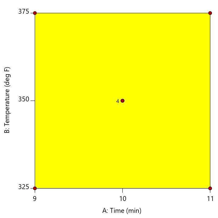
A center point is located at the exact mid-point of all factor settings. The example in Figure 2 shows a cookie baking experiment where the center point is replicated four times at the mid-point of 10 minutes and 350 degrees.
Multiple center points (replicates) should be randomized throughout the other experimental conditions to get an adequate assessment of whether the actual values measured at this point match what is predicted by the linear model. This is called a test for curvature. If the curvature test is significant, this is considered evidence that a quadratic or higher order model is required to model the relationship between the factors and the response. If the curvature test is not significant, then it is okay to assume that the linear model fits in the middle of the design space.
In Design-Expert® software, version 11, the curvature test is placed in front of the ANOVA when you have included center points in the design. This immediately shows you if the model is significant, and if the curvature is significant. As illustrated by the screen shot below (Figure 3), advice is provided to guide your next steps.
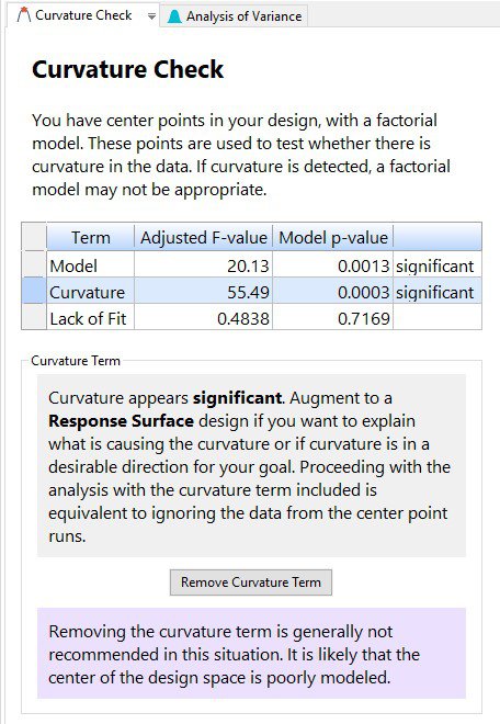
New to DX11, is the “Remove Curvature Term” button. If curvature is significant and you click on this button, then the regression modeling is done by using all the data, including the center points. Because the actual center points are not sitting in the middle of the design space, it is highly likely that the resulting model will be poorly fit and the lack of fit statistic will be significant. Then, click on “Add Curvature Term” to put the curvature effect back into the model, thus accounting for the information in the middle of the design space.
Ultimately, if curvature is significant, the recommendation is to augment the design to a response surface design to better model the relationship between the factors and the response. If curvature is NOT significant, then proceeding with the analysis is acceptable.
For further details on curvature, check out the DOE Simplified textbook, or enroll in an upcoming Modern DOE for Process Optimization workshop.
Bonus: Check out Mark’s 1-minute video on this topic: MiniTip 2 - Center points in factorials
How To Save Costly Project Engineering Time With This Innovative Application of Response Surface Models (RSM)
Lead engineers are incredibly overworked and their time is disproportionately valuable compared to some more junior engineers. But when it comes to doing project cost estimations, we don't have much of a choice but to ask some of these high-value engineers for the estimates if we want a realistic level of accuracy. Plus, the unfortunate reality is that many project costs end up being too high to justify the screening business case, so the project is canceled, and the high-value engineering time is wasted. I found a unique solution to this time sink using RSM to create a Ballpark Project Cost Estimator.
Not only did the ballpark estimator reduce engineering time spent on early phase projects, it also shortened the market opportunity evaluation timeline. This enabled a level of market opportunity screening that the organization had never experienced before. It ended up being an incredibly useful business tool that I wish more organizations had the benefit of using. I am excited to share the 5 steps to creating your own Ballpark Project Cost Estimator.
1. Build and Define Structured Cost Driver Definitions
Develop a list of items that are most likely to drive project cost. Things like new suppliers, re-use of new or existing product platforms, level of tear up/re-work, project timeline and so forth. 7-15 factors is probably reasonable. Then define very clearly what each scoring level of each factor would be. In one case, we used 1,3,9 ordinal scaling for each level, since that was the numbering we used habitually. In the example, we're using 1, 2, and 3. Any ordinal, interval or ratio scale of measurement can work as long as responses are defined clearly enough. Figure 1 shows a few examples of defined factor level descriptors.

Figure 1. Project cost driver factor level definitions example. This is the recommended level of structure around each factor scoring level.
2. Survey Qualified Personnel
Once the structure around consistently defining scores is built, ask the project manager and chief engineer to score all of the projects which were run in recent history. We used projects from the last 5–7 years, but what your organization uses will depend on project length and reasonable confidence that people will remember well enough to score fairly.
3. Analyze
With the scores for each factor and the actual finance data for each project, use the Historical Data Model in Design-Expert® software. We're going to mostly use Numeric Factors with Discrete Responses at 3 levels. If you decide to define your inputs on a sliding scale, then you would do this differently.

Figure 2. Historical Data Design for the sample project. We’re using 3 discrete levels for numerical factors to analyze the structured survey data.
In a real application, I found that I only had enough projects to build a linear model of the predicted expense for a given score of the twelve tri-level ordinal factors. In the sample, since I'm using fewer factors I have enough data for a higher-level model so I'm going to use it just because I can! Tip: when entering the design data, right click in the top left area of the data table and add a comments column. Or, select View > Display Columns > Comments. Put the project name in that column so that we can view it later on during the analysis phase.
In some real applications, there were some areas of the modeled space which had almost no data. But that is actually not a problem at all if we think critically about it. Since future projects will most likely look like projects that have been done in the past, there should be few projects that are in areas of the design space that don't have any data. Figure 2 shows one area of the model that illogically would cost less than zero dollars. This area has no actual data and illustrates this point.
Being aware of this limitation is why we implemented some of the process steps in step 5 around our understanding of the limitations of this tool. Figure 2 also shows the power of the crosshairs window view. It is showing that in the current area, the ballpark project cost is ~$6.5M, with a 95% CI Low of $3.5M and 95% CI High of $9.4M. That's a fairly wide range, but it's good enough to start a conversation about whether the project is worth investing in.

Figure 3. RSM screenshot of the sample data with cross-hairs window open from View > Show Crosshairs Window
4. Test and Add Supporting Information
Once we had the model built, we were able to compare the prediction of the model with some recent engineering project estimates—and they were freakishly accurate. We also added some additional capability when a model projection was made. We found that if you compare the product of all the products of the actual coefficient and factor scores (contrast that with the sum of products of actual coefficient and factor scores used for the Actual Equation), there was a nice correlation between the projects that all had similar scores. So we used that to do a reverse lookup and pull in which projects were similar. (Yes, there is a risk of two equally weighted factors being aliased, but we were OK with that since the use of the result is primarily subjective).
As a result, anytime someone used the model, it would spit out a projected value and a list of the projects that were the closest in terms of similar "product of product" scores. To use Design-Expert's built-in capability here, go to Display Options > Design Points > Show and the actual points you measured will show up on the interactive plots. This will also show the project name that you previously added to the comments column in the design data entry.
5. Develop Process that Supports the Intention of the Tool
In real-world use, we made sure to cover the limitations of the tool with careful consideration of its use within a process. When the tool was done, we knew what it was capable of, but also knew what it wasn't capable of. So we made sure to develop an appropriate process that supported when and where the tool was used. The tool was used early on in project chartering and market profitability analysis. We wanted to avoid ever having an engineer held responsible for a budget that came from the ballpark estimators, we only wanted to use them to reduce the number of weeks our highly talented engineers spent doing estimates that didn't require a high level of accountability.
Conclusion
With some very structured definitions of project cost driver characterization and Design-Expert software we were able to nearly eliminate the time that high-value engineers spent on early-stage project cost estimations. This enabled our product planning, strategy, and budgeting offices to speed up their early stage planning while reducing the load on our overtaxed engineers. We also built some process around the limitations of the tool to ensure that the organization wouldn't end up in a situation without clear lines of accountability. This is a great example of the many ways that DOE, RSM, and statistical methods can streamline business planning.
About the Guest Author
Nate Kaemingk is an experienced project manager, consultant, and founder of Small Business Decisions. He writes about business decision making and the unique business solutions that are possible by combining statistics with business. His focus is on providing every business decision-maker with access to clear, concise, and effective tools to help them make better decisions. For more information, visit his website linked above, or email him.
Five Keys to Increase ROI for DOE On-Site Training
A recent discussion with a client led to these questions—“How do we keep design of experiments (DOE) training “alive” so that long-term benefits can be seen? How do we ensure our employees will apply their new-found skills to positively impact the business?” In my 20+ years as a DOE consultant and trainer, I have seen many companies who invested in on-site training, only to have it die a quick death mere days after the instructor leaves. On the other hand, we have long-term relationships with clients who have fully integrated design of experiments into the very culture of their research and development, and wouldn’t consider doing it any other way. What are the keys that lead the latter to success?
Key #1: Top-Down Management Support
Management must focus on long-term results versus short-term fixes. Design of experiments is a key tool to gain a fundamental understanding of processes. When combined with basic scientific and engineering knowledge, it helps technical professionals discover the critical interactions that drive the process. It’s not free, experimentation costs time and money. But forward-thinking companies understand that the long-term gains are worth the short-term expense. Management needs to buy-in to the use of DOE as a strategic initiative for future success.
Key #2: Data-Driven Decisions
Long-term success is achieved when management insists on using data to make decisions. My first engineering role was in a company that told us “All decisions are made based on data.” Engineers were expected to collect data and bring it to the table. DOE was one of the preferred methods to collect and analyze data to make those decisions. Key #2 is ingraining the expectation into the business that data-driven results will benefit the company longer than gut-feel decisions.
Key #3: Peer-to-Peer Learning
People like to learn from each other. Training can be sustained by learning from DOE’s done by peers. One way to support this is to plan monthly “lunch and learn” sessions. Everyone brings their own lunch (or order pizza!) and have 2-3 people do informal presentations of either an experiment recently completed, or their proposed plan for a future experiment. If the experiment is completed, review the data analysis, lessons learned, and future plans. If it is a proposed DOE plan, discuss potential barriers and roadblocks, and then brainstorm options for solving them. The entire session should be run in an open and educational atmosphere, with the focus on learning from each other. This key demonstrates the practical application of DOE and inherently encourages others to try it.
Key #4: Practice, Practice, Practice
Company management should plan that the output of on-site training is a specific project to apply DOE. Teams should plan an experiment that can be run as soon as possible to reinforce the concepts learned. As DOE’s are completed, the data can be shared with classmates simply to provide everyone with some practice datasets. The mantra “use it or lose it” is very true with data analysis skills and setting aside some time to get together and review company data will go a long way towards reinforcing the skills recently learned. Schedule a follow-up webinar with the instructor if more guidance is needed.
Key #5: Local Champions
There are always a couple of people who gravitate naturally towards data analysis. These people just seem to “get it”. Invest in those people by providing them with additional training so that they can become in-house mentors for others. This builds their professional reputation and creates a positive, driving force within the company for sustainability.
Summary
The investment in on-site training should include a company plan to sustain the education long-term. Good management support is an essential start, establishing expectations on using design of experiments and other statistical tools. Employees should then be connected with champions, followed by opportunities to apply DOE’s and share practical learning experiences with their peers.