Stat-Ease Blog

Categories
Thinking Outside the Box by Using Standard Error to Constrain Optimization
Response surface methods (RSM) pave the way to the pinnacle of process improvement. However, the central composite design (CCD)—the most common layout for RSM (pictured in Figure 1 for three factors)—traditionally limits the region of prediction to the cubical core. This conservative view avoids dangerous extrapolation out to the far reaches of the space defined by the axial ranges of the star points. This article lays out a less-limiting (but still reasonably safe) approach to optimization based on using a specified standard error (SE) of prediction as the boundary for searching out the optimal process setup.
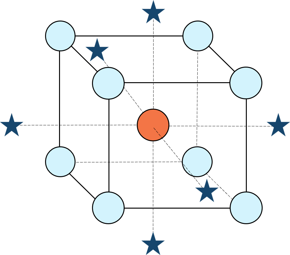
Figure 1: Central composite design for three factors
Three different methods for defining the search area will be detailed for a four-factor CCD. The goal is to avoid extrapolating beyond where the data provides adequate knowledge about the response while maximizing the volume that will be explored.
Let’s compare three boundaries for defining the search area in the factor space, the first two of which do not make use of the SE:
1. Factorial bounded—the hypercube* with vertices at coded values ±1, thus each edge spans 2 coded units. The volume of this four-dimensional hypercube is 16 (=2x2x2x2). The maximum SE is 0.764, which occurs at the vertices (i.e., corners). See figure 2. For comparison’s sake, we will use this SE (0.764) as our benchmark—anything more than this will be deemed unacceptable.
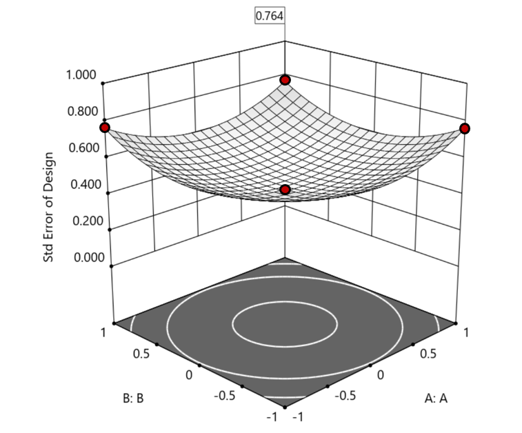
Figure 2. Looking only at the factorial region (±1), with factors C and D set to +1, we see that the highest SE values observed are at the factorial corners.
2. Axial (star-point) bounded—a cube with vertices at ±2 to include the star runs.
The volume of this four-dimensional hypercube is huge: 256 coded units (=4x4x4x4), which offers big advantages for optimization. However, most of the volume (69%) exhibits an SE ≥ 0.764 (maximum is 2.963!). Therefore, this method must be rejected. See figure 3.
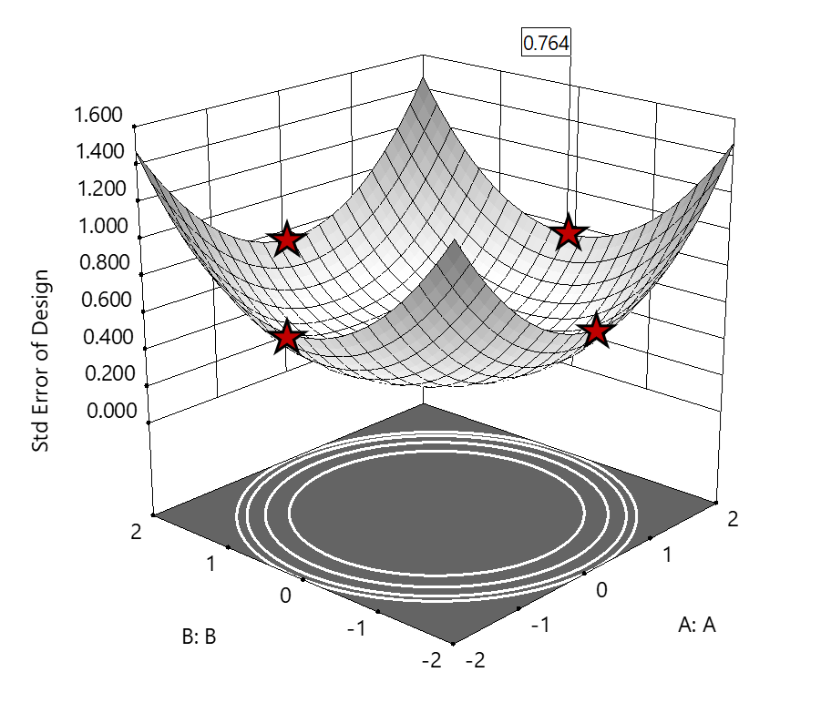
Figure 3. The default axial point placement is at ±2, which for 4 factors creates a rotatable design. The axial points therefore have the same SE as the factorial corner points—all are equidistant from the center. Note that factors C and D are set to zero (center) and the range for factors A and B are increased to ±2 to show the axial points.
3. Standard error bounded—the area within SE ≤0.764.*
Once again looking at figure 3, the SE at the axial (star) points equals that of the ±1 factorial points. Limiting the standard error ≤0.764 produces a hypersphere with a radius of 2. The volume of this hypersphere is 78.96, almost five times larger than the ±1 factorial hypercube.
Summarizing the three methods of defining the search area in the factor space:
- The factorial cube with vertices at ±1 may be too restrictive and may not include all the volume where acceptable predictions could be made.
- A cube with vertices at ±2 that includes the axial runs is too liberal; most of the volume has poor predictions.
- Defining the search area by standard error may prove insightful—it includes all the areas where acceptable predictions may reside.
Using standard error to constrain the optimization defines a search area that matches its properties:
- Spheres for rotatable CCDs. (Note: The above graphics and discussion assumed the choice of alpha values produced a spherical standard error plot).
- Cubes for face-centered CCDs.
- Irregular shapes for central composite designs with alpha between 1 and that recommended for rotatable designs, optimal designs, models for which model reduction was applied, and historical data.
An added bonus to using SE is that it adjusts the search area for reduced models and/or missing data.
It should be noted that it is assumed the design was sized for precision and contains enough data to make sound predictions within the cube (or hypercube). If the FDS is low (for example, below 80%), then making good predictions within the cube is already challenged. Extending the search zone outside the cube would exacerbate things further.
Another caveat is the assumption that a quadratic model pertains outside the design cube. The primary purpose of axial points in a central composite design is to fortify the estimates of quadratic terms to be applied within the cube. Sometimes the specified quadratic model performs well inside the cube, but extrapolation becomes dangerous due to higher-order behavior beyond the faces of the cube. Checking the diagnostic plots for anomalous behavior of the axial points can provide some assurance that the quadratic model is useful beyond the cube.
So, the key takeaway is this. Adding standard error to the search criteria and expanding the factor ranges beyond the edges of the factorial cube can be helpful for making judicious extrapolations beyond the edges of the cube. Simply applying the highest standard error found within the cube to regions outside the cube is a reasonable place to start, especially when the FDS performance of the design is over 80%. It is advisable to treat any interesting discoveries as tentative until verified by confirmation runs, augmented designs, or an entirely new design focused on the projected area of interest.
For more information on how to include standard error in the optimization module, see: Extrapolating a Response Surface Design in the Stat-Ease software Help menu.
*For 3 factors we can envision the factorial design space as a cube. With more than 3 factors (in this case 4 factors) we refer to the analogous region as a hypercube.
Acknowledgement: This post is an update of an article by Pat Whitcomb of the same title, published in the April 2017 STATeaser.
Like the blog? Never miss a post - sign up for our blog post mailing list.
Good Enough is Great: Why the Simpler Model Might Be Best
(Adapted from Mark Anderson’s 2023 webinar “Selecting a Most Useful Predictive Model”)
There can be a moment when analyzing your response surface method (RSM) experiment that you feel let down. You designed it carefully, maybe as a central composite design built specifically to capture curvature via a quadratic model, but when the results come in, the fit statistics tell you that a linear model fits just fine—no curves needed.
At this point you probably feel cheated. You paid for quadratic, but you only got linear. Now you have to recognize that's not a failure: that's the experiment doing its job.
Designed for Quadratic, Fitted with Less
When George Box and K.B. Wilson developed the central composite design back in 1951, they built it to estimate a full quadratic model: main effects, two-factor interactions, and squared terms that let you map response peaks, valleys, and saddle points. It's a powerful structure, and for many process optimization problems you'll need every bit of it. But not always.
Take a typical study with three factors: say, reaction time, temperature, and catalyst concentration; and two responses to optimize, for example, conversion (yield) and activity. Fit the conversion response, and the quadratic earns its keep. The squared terms are significant, and curvature is real. You get a rich surface to work with. Satisfying.
Then you turn to activity. You run through the same fitting sequence: check the mean, add linear terms, layer in two-factor interactions, and try the quadratic, but the data keeps saying “no thank you” at each step beyond linear. The sequential p-values tell a clear story: main effects matter, but the added complexity contributes nothing.
The right answer isn't to force a quadratic model because that's what you designed for. Use the linear model. That's what the data supports.
Simpler Models Are Easier to Trust
A more parsimonious model—statistician-speak for "simpler, with fewer unnecessary terms"—has real advantages beyond just passing significance tests. Every term you add raises the risk of overfitting: chasing noise instead of signal. A model stuffed with insignificant terms can look impressive on paper while quietly falling apart when you try to predict new results.
The major culprit for bloated models is the R-squared (R²) statistic that most scientists tout as a measure of how well they fitted their results. Unfortunately, R² in its raw form is a very poor quality-indicator for predictive models because it climbs whenever you add a term, regardless of whether it means anything. It is far better to use a more refined form of this statistic called “predicted” R², which estimates how well your model will perform on data it hasn't seen yet.
Trim the insignificant terms from a bloated model and you'll often see predicted R² go up, even as raw R² dips slightly. That's a good sign. For a good example of this counterintuitive behavior of R²s, check out this Stat-Ease software table showing the fit statistics on activity fit by quadratic versus linear models:
| Activity (quadratic) | Activity (linear) | |
|---|---|---|
| Std. Dev. | 1.08 | 0.9806 |
| Mean | 60.23 | 60.23 |
| C.V. % | 1.79 | 1.63 |
| R² | 0.9685 | 0.9564 |
| Adjusted R² | 0.9370 | 0.9477 |
| Predicted R² | 0.7696 | 0.9202 |
| Adeq Precision | 18.2044 | 29.2274 |
| Lack of Fit (p-values) | 0.3619 | 0.5197 |
By the way, if you have Stat-Ease software installed, you can easily reproduce these results by opening the Chemical Conversion tutorial data (accessible via program Help) and, via the [+] key on the Analysis branch, creating these alternative models. This is a great way to work out which model will be most useful. Don’t forget, all else equal, the simpler one is always best—easier to explain with fewer terms to tell a cleaner story.
Here's a guiding principle: if adjusted R² and predicted R² differ by more than 0.2, try reducing your model. Bringing those two statistics closer together is usually a sign you're moving in the right direction.
So, When Do You Stop Tweaking?
This is where a lot of practitioners get into trouble—not by underfitting, but by endlessly refitting. There's always another criterion to check, another comparison to agonize over. Beware of “paralysis by analysis”!
George Box said it well: all models are wrong, but some are useful. The goal isn't a perfect model. The goal is a useful one. Here's how you know when you’ve made a good choice:
Check adequate precision. This statistic measures signal-to-noise ratio: anything above 4 is generally good. Strong adequate precision alongside reasonable R² values usually means you have enough model to work with, even if lack of fit is technically significant. (Lack-of-fit can mislead you, particularly when center-point replicates are run by highly practiced hands who nail that standard condition every time, giving you an artificially tight estimate of pure error.)
Look at your diagnostics, but don't over-interpret them. The top three are the normal plot of residuals, residuals-versus-run, and the Box-Cox plot for potential transformations. On the normal plot, apply the “fat pencil” test: if you can cover the points with a broad marker held along the line, you're fine. You're looking for a dramatic S-shape or an obvious outlier, not minor wobbles.
Try the algorithmic reduction, then compare. Stat-Ease software offers automatic model reduction tools. Run it, compare the reduced model to the full model on predicted R² and adequate precision, and make a judgment call. If the statistics are similar and the model is simpler, take it.
Then press ahead. Once you've checked your fit statistics, run your diagnostics, and done a sensible reduction, go use the model! You can always get a second opinion (Stat-Ease users can request one from our StatHelp team), but at some point the model is good enough. That's the whole point.
The Liberating Truth
There's something freeing about accepting a linear model from an experiment designed for a quadratic. It means your process is well-behaved in that region, easy to interpret and likely to predict well. Now you can get on with finding the conditions that meet your experimental goals—a process that hits the sweet spot for quality and cost at robust operating conditions.
The experiment isn't a failure when it gives you something simpler than expected. It's doing exactly what a good experiment should do: telling you the truth.
Like the blog? Never miss a post - sign up for our blog post mailing list.
March Publication Roundup
Here's the latest Publication Roundup! In these monthly posts, we'll feature recent papers that cited Design-Expert® or Stat-Ease® 360 software. Please submit your paper to us if you haven't seen it featured yet!
While none of this month's publications met our standards for a featured article (publicly accessible & correctly applying DOE), they're still all quite interesting! Take a look.
New publications from March
- Development of engineered magnetic liposome/exosome hybrid as a novel caffeine nanocarrier for restraining liver fibrosis induced in rats
Scientific Reports volume 16, Article number: 5349 (2026)
Authors: Yara E. Elakkad, Hanan Refai, Hanaa H. Ahmed, Ahmed N. Abdallah, Menna M. Abdellatif, Ola A. M. Mohawed, Rehab S. Abohashem - Correlation between carbon percentage and nanocomposite performance in commodity and engineering thermoplastics (ABS, HIPS, PP, and PC)
Scientific Reports volume 16, Article number: 8492 (2026)
Authors: Mahmoud A. Essam, Amal Nassar, Eman Nassar, Mona Younis - Design expert and python-based optimization of recycled aggregate concrete with a comparative analysis of ANN and M5P-tree models for predicting compressive strength
Journal of Building Engineering, Volume 123, 1 April 2026, 115865
Authors: Yousif J. Bas, Jamal I. Kakrasul, Kamaran S. Ismail, Samir M. Hamad
Mixture Designs – Gimmick or Magic?
Years ago, I attended Stat-Ease’s Modern DOE workshop in Minneapolis—a five day deep dive into factorial and response surface methods (RSM). I then completed a four day course on Mixture Design for Optimal Formulations. Since then, I’ve trained practitioners and coached users through hundreds of experiments. One pattern is consistent: most people—myself included—gravitate toward familiar factorial or RSM designs and hesitate to use mixture designs for formulation work.
The result is force-fitting RSM tools onto mixture problems. Like using a flathead screwdriver on a Phillips screw, it can work, but it’s rarely ideal. And, avoiding mixture designs can actually create real problems. So, what makes mixtures unique, and what goes wrong when we ignore that?
Why Mixtures Are Different
In mixtures, ratios drive responses, not absolute amounts. The flavor of a cookie depends on the ratio of flour, sugar, fat, and salt; not the grams of sugar alone. And because mixture components must sum to a total (often 100%), choosing levels for some ingredients automatically constrains the rest.
The Ratio Workaround—and Its Limits
A common workaround is to convert a q-component mixture into q-1 ratios and run a standard RSM design¹. For example, suppose we’re formulating a sweetener blend (A = sugar, B = corn syrup, C = honey) that always makes up 10% of a cookie recipe. If we express the system using ratios B:A and C:A, we can build a two factor RSM design with ratio levels like 1:1, 2:1, and 3:1.
But compared to a true three component mixture design, the difference is clear. The ratio based design samples only narrow rays of the mixture space, leaving large regions unexplored. Standard error plots show that a proper mixture design provides far better prediction capability across the full region.
Figure 1. Optimal 10-run RSM design layout using two ratios for a three-component mixture. The shading conveys the relative standard error: lighter is lower, darker is higher.
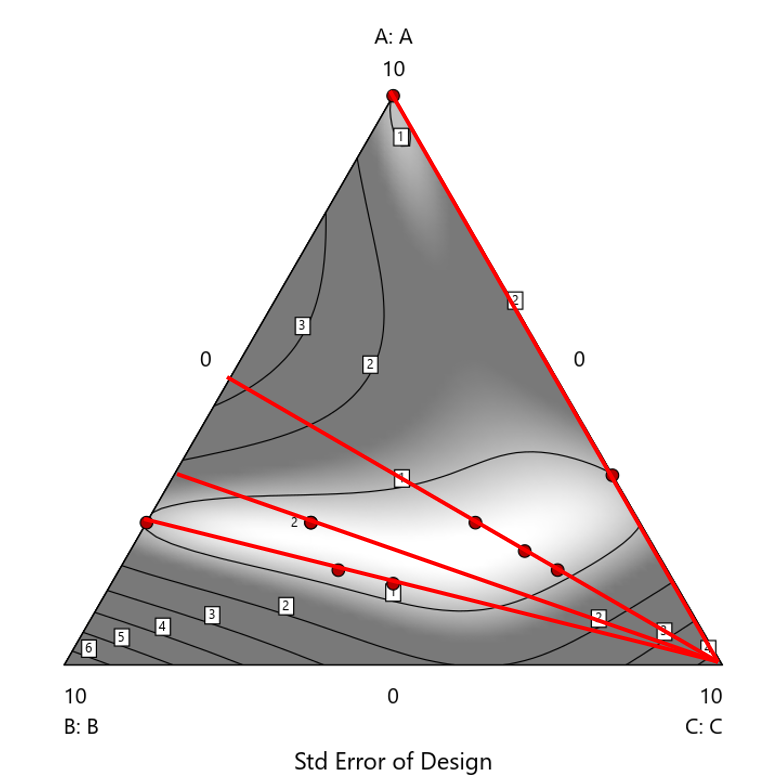
Figure 2. Translation of the ratio design from Figure 1 onto a three-component layout.
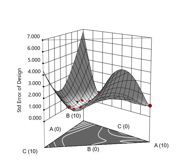
Figure 3. Standard error 3D plot of the 10-run ratio design.
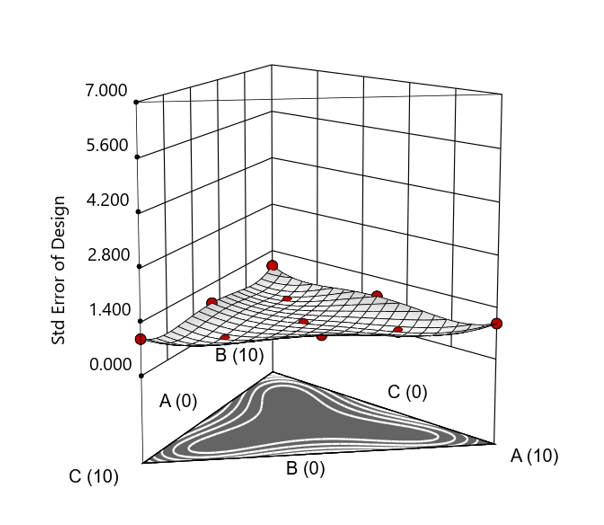
Figure 4. Standard error 3D plot for a 10-run augmented simplex mixture design.
In short: the ratio trick can work, but it never matches the statistical properties of a proper mixture design.
The Slack Component Argument
Another justification for using RSM is when one ingredient is believed to be inconsequential. Perhaps the component is believed to be inert or is simply a diluent that makes up the balance of a formulation. The idea is to treat this component as a slack variable and allow it to fill whatever space remains after setting the other ingredients. One slack approach is to simply use the upper and lower values as levels of the non slack components in a standard RSM. Below is a comparison of a three-component system analyzed as a true mixture design alongside a two-factor RSM that eliminates the diluent as a component.
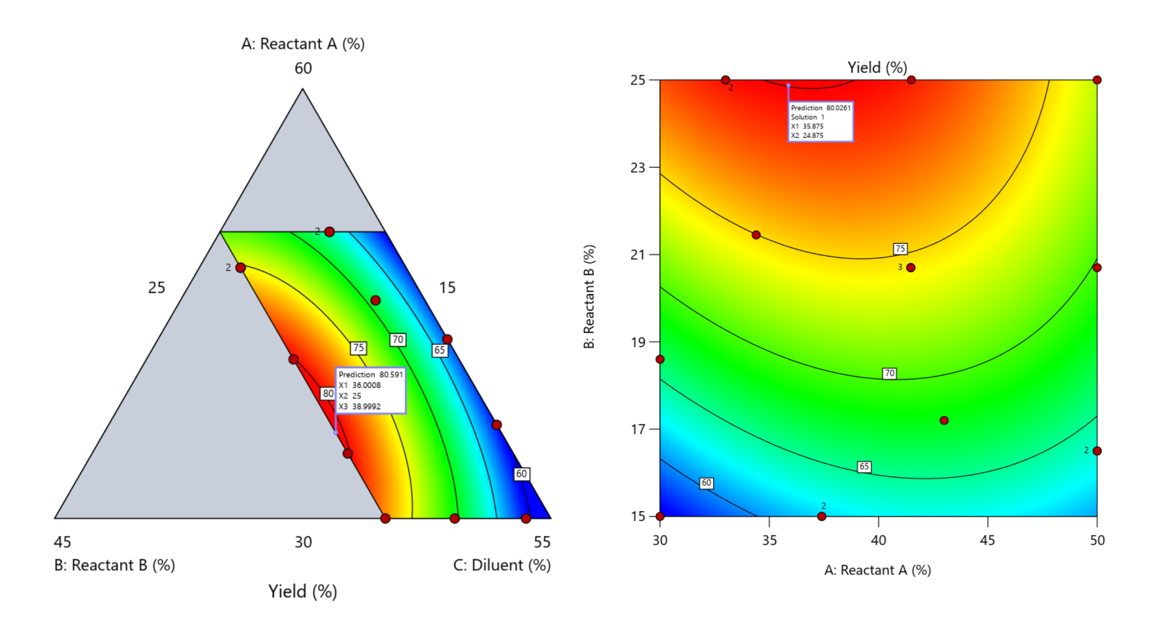
Figure 5. Optimization comparison of a three component mixture design and a two factor (component) RSM approach
In this case, both approaches found essentially the same optimal conditions. Ignoring the diluent really didn’t impact the story, but the RSM approach is not specifically assessing the interactive behavior between the reactants and the diluent. If we study the system as an RSM, we assume the interactions involving the omitted component were not consequential—which may not be true. Cornell² states that the factor effects we are seeing are actually the effects confounded with the opposite effect of the ignored component. Without using a mixture design, we would have no way of validating our assumptions about these interactions.
Cornell³ also describes an alternative slack approach where the slack component is included in the design but excluded from the predictive model. Some practitioners believe this approach makes sense when the diluent interacts weakly with the key ingredients, the omitted component is the one with the widest range of proportionate values, or if that component makes up the bulk of the formulation. But statistically, this presents some interesting complexities.
Using the above chemical reaction example, Figure 6 shows the model differences between the Scheffé approach and the resulting models when each component is considered the slack component.
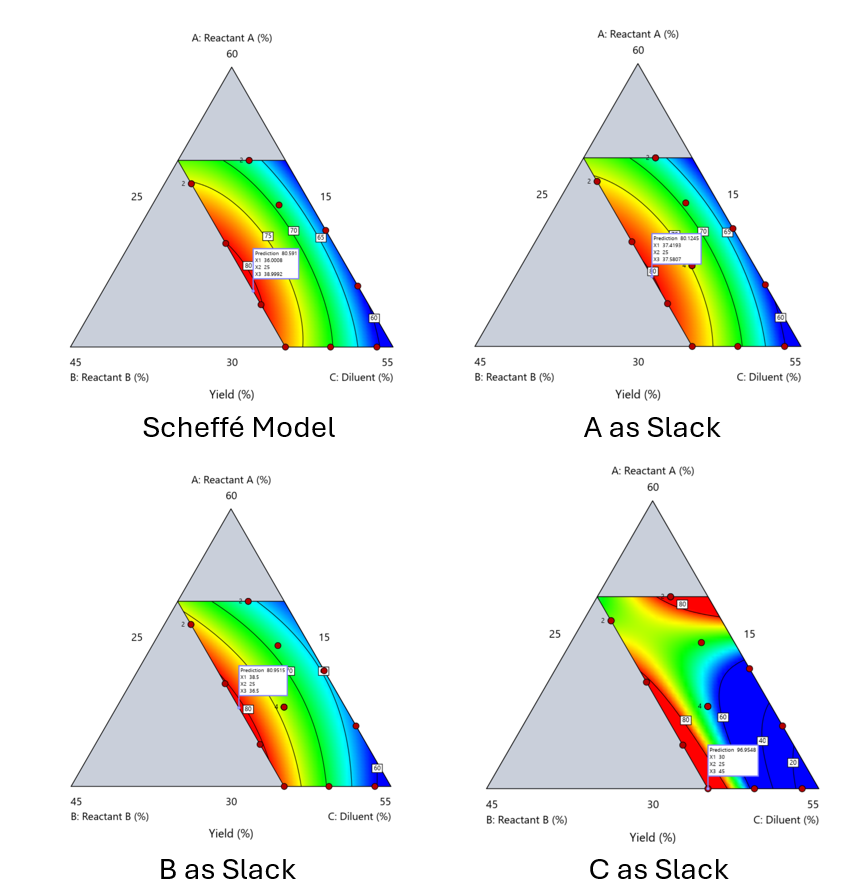
Figure 6. Comparing the Scheffé and Slack modeling techniques.
Note that in this example, while some of the models are similar, the one involving the diluent as the slack variable differs most from the Scheffé standard. Had we assumed the diluent could have been used as the slack variable, we would have poorly modeled and optimized the system.
Because slack variable models exclude at least one component and its interactions, they’re best avoided when possible.
When Components Don’t Share a Scale
Mixture designs require all components to share a common basis (percent, ppm, etc.). This becomes awkward when ingredients span vastly different scales—for example, large amounts of reactants plus a catalyst at ppm levels. The phenomenon is often called the “sliver effect” because the design space becomes a very narrow region for the low-level component, as shown in Figure 7.
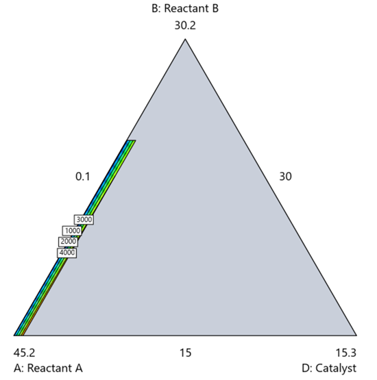
Figure 7. The sliver effect that can occur when one component is present in much lower levels than the balance of the formulation.
One way to avoid a sliver is to change the metric: in this case, changing to molar percent may put the components on a comparable basis and all components could have been included in the mixture design. Or, if I’m still avoiding mixtures, a practical solution is a combined design: treat the main ingredients as a mixture and the catalyst as a process variable. Both the mixture and the catalyst should be modeled quadratically to capture interactions. However, the interactive nature of components is best resolved when all ingredients are included in the mixture design.
The Bottom Line
For formulations, and recipes, the best results come from designs built specifically for mixtures. They’re not gimmicks or magic; they’re the right tools for the job. Stat-Ease provides tutorials and webinars to help you get started:
- A Crash Course in Mixture Design of Experiments
- Optimal experiment designs that combine mixture, process and categorical inputs
Or, if you’d prefer a hands-on, instructor-led experience (maybe with me!), sign up for one of the following courses:
References:
- Response Surface Methodology, 4th edition, Myers, Montgomery, Anderson-Cook, pp. 759-763 (Wiley).
- Experiments with Mixtures, 3rd edition, John Cornell, p. 16 (Wiley).
- Experiments with Mixtures, 3rd edition, John Cornell, p. 333-343 (Wiley).
Like the blog? Never miss a post - sign up for our blog post mailing list.
Mastering mixture modeling
Mixture models (also known as "Scheffé," after the inventor) differ from standard polynomials by their lack of intercept and squared terms. For example, most of us learned about quadratic models in high school and/or college math classes, such as this one for two factors:
These models are extremely useful for optimizing processes via response surface methods (RSM) such as central composite designs (CCDs).
Mixture models look different. For example, consider this non-linear blending model for the melting point (Y) of copper (X₁) and gold (X₂) derived from a statistically designed mixture experiment*:
As you can see, this equation, set up to work with components coded on a 0 to 1 scale, does not include an intercept (ß₀) or squared terms (X₁², X₂²). However, it works quite well for predicting the behavior of a two-component mixture. The first-order coefficients, 1043 and 1072, are quite simple to interpret—these fitted values quantify the measured** melting points in degrees C for copper and gold, respectively. The difference of 29 characterizes the main-component effect (copper 29 degrees higher than gold).
The second-order coefficient of 536 is a bit trickier to interpret. It being negative characterizes the counterintuitive (other than for metallurgists) nonlinear depression of the melting point at a 50/50 composition of the metals. But be careful when quantifying the reduction in the melting: It is far less than you might think. Figure 1 tells the story.
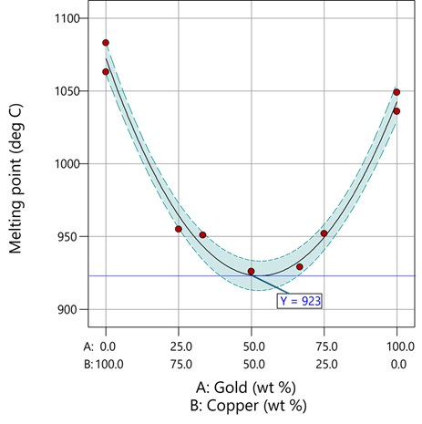
Figure 1: Response surface for melting point of copper versus gold
First off, notice that the left side—100% copper—is higher than the right side—100% gold. This is caused by the main-component effect. Then observe the big dip in the middle created by a significant, second-order impact from non-linear blending. Because of this, the melting point reaches a minimum of 923 degrees C at and just beyond the 50/50 blend point. This falls 134 degrees below the average melting point of 1057 degrees. Given the coefficient of -536 on the X₁X₂ term, you probably expected a much bigger reduction. It turns out 541 divided by 4 equals 134. This is not coincidental—at the 50/50 blend point the product of the coded values reaches a maximum of 0.25 (0.5 x 0.5), and thus the maximum deflection is one-fourth (1/4) of the coefficient.
If your head is spinning at this point, I advise you not to attempt to interpret coefficients of the mixture model beyond the main component effects and, if significant, only the sign of the second-order, non-linear blending term, that is, whether it is positive or negative. Then after validating your model via Stat-Ease software diagnostics, visualize the model performance via our program’s wonderful model graphics—trace plot, 2D contour, and 3D surface. Follow up by doing a numeric optimization to pinpoint an optimum blend that meets all your requirements.
However, if you would like to truly master mixture modeling, come to our next Fundamentals of Mixture DOE workshop.
* For the raw data, see Table 1-1 of A Primer on Mixture Design: What’s in it for Formulators. Due to a more precise fitting, the model coefficients shown in this blog differ slightly from those presented in the Primer.
** Keep in mind these are results from an experiment and thus subject to the accuracy and precision of the testing and the purity of the metals—the theoretical melting points for pure gold and copper are 1064 and 1085 degrees C, respectively.
Like the blog? Never miss a post - sign up for our blog post mailing list.